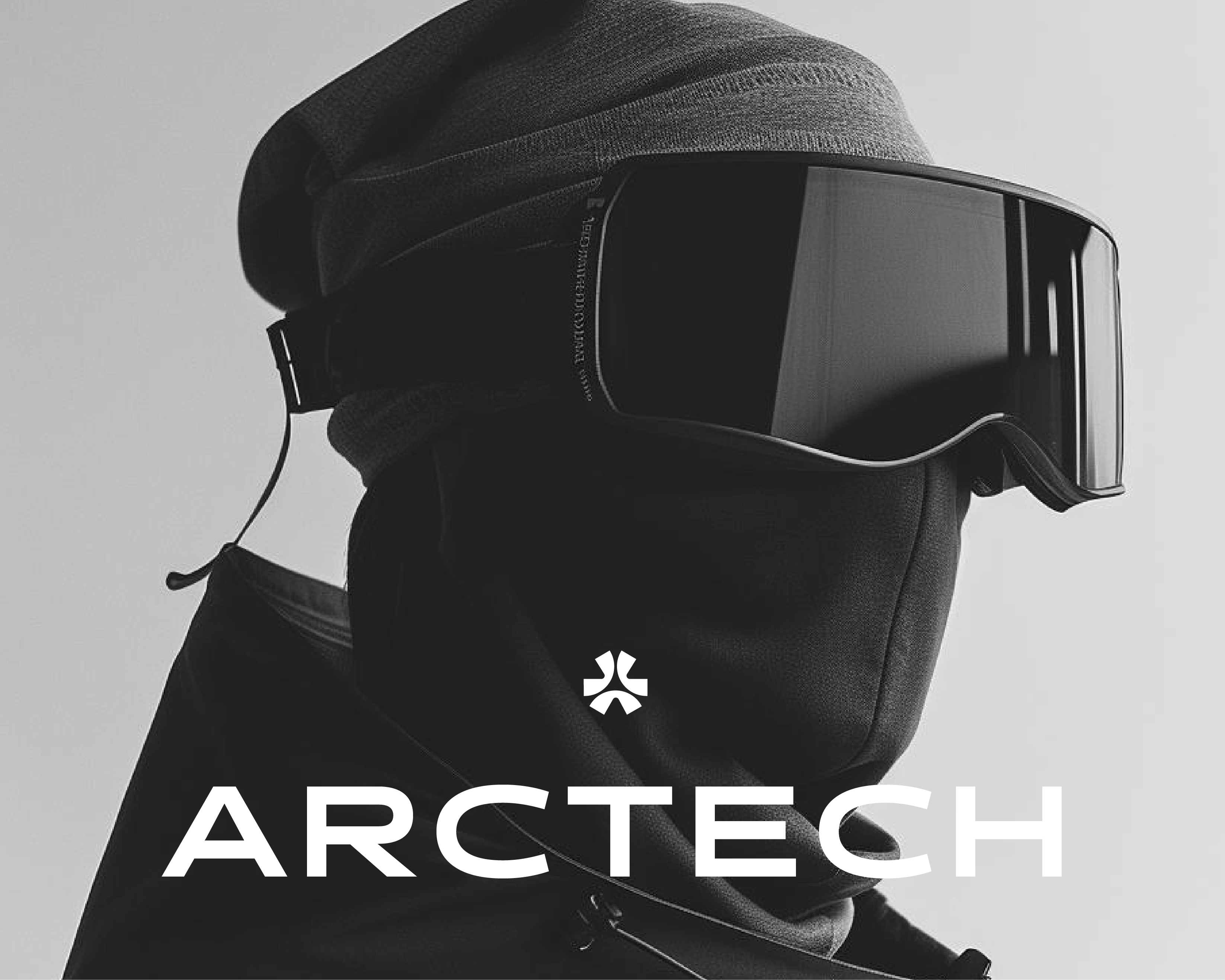
METAL DIVISION
Logo and Visual Identity Design
Arad, Romania 2024
Logo & Branding: David Julean
Art Direction & Animation: Raul Lile
JCM Metal Division is a company based in Arad, Romania that focuses on metal structures and CNC specialised tasks. Founded in 2016 as a sister company to JCM Professional Buildings, Metal Division has since grown to become a leading power in western Romania. Equipped with the latest technologies in CNC operations they have doubled their production capacity in the last 2 years.
This quick growth also meant the company needed a new and more appropriate brand identity.
We were tasked with revamping their previous logo and create a visual identity that can compete both in a very fast paced market as well as attract on social media, will still maintaining a minimal design philosophy that can be used on equipment, brand stationary and the digital space.
Concept Breakdown
Logo Architecture & Design Language
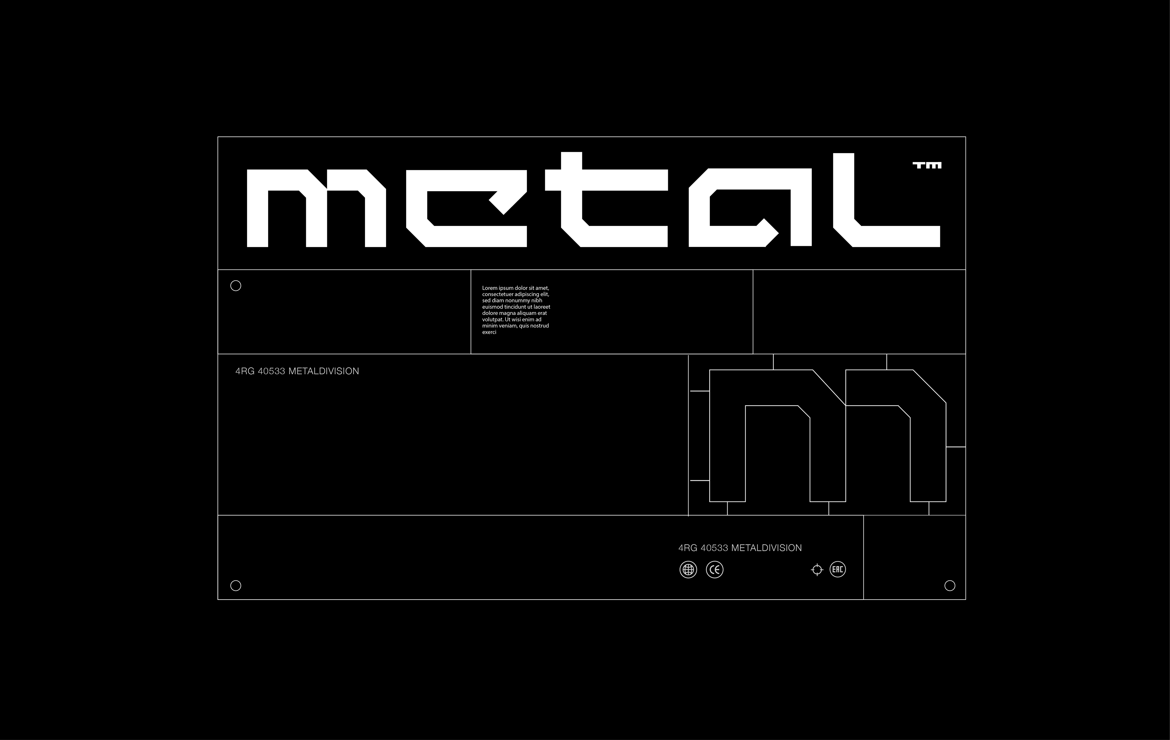
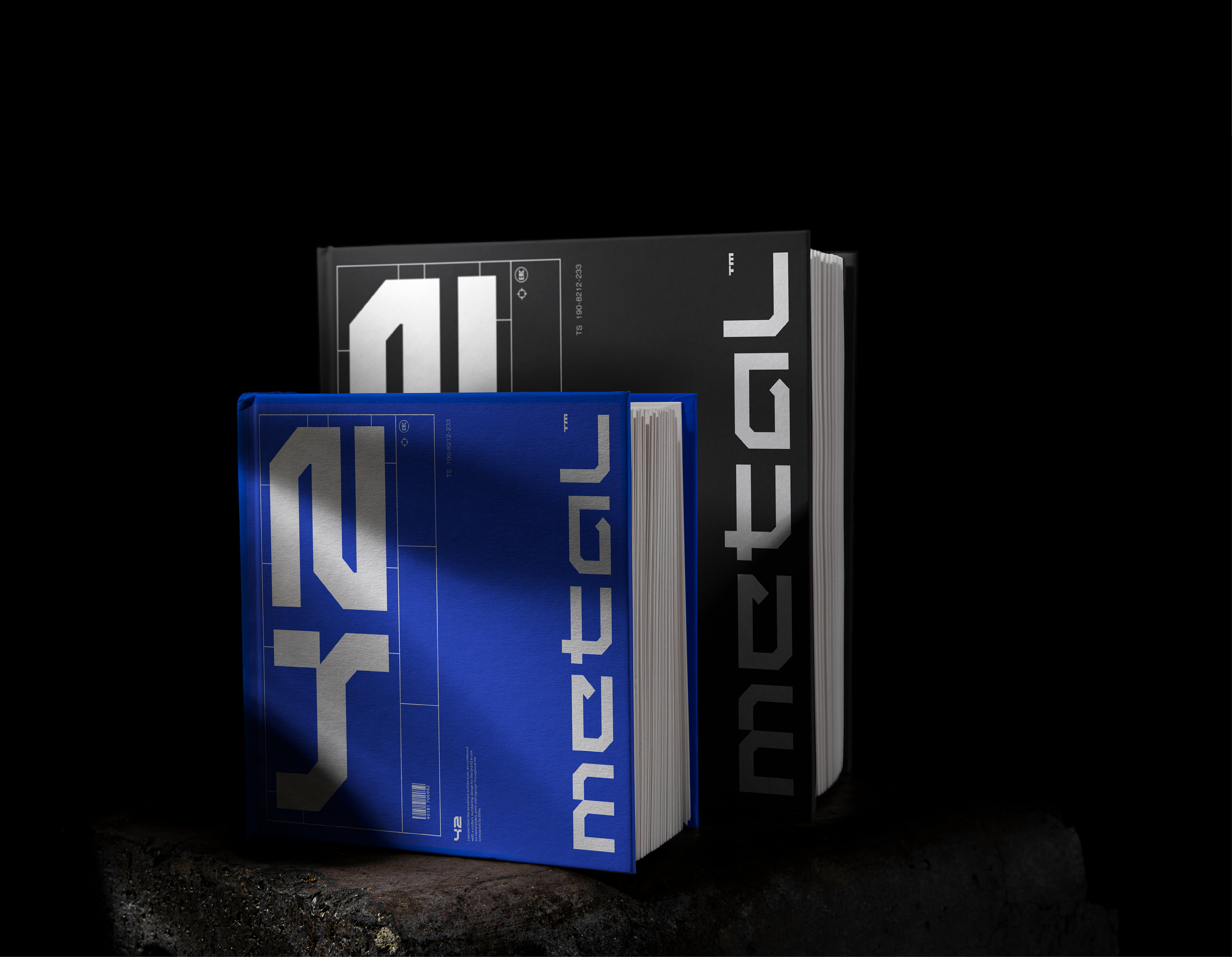
As CNC cutting is all about precision and planning we wanted to build the entire design concept on these two attributes. A minimalist approach was adopted inspired by the straight and sharp cutting lines programed for a a CNC machine before it goes into action.
We decided to go for a word mark instead of a symbol as our main logo. The 5 letters forming the name "metal" are all constructed using two lines that guide the thickness, spacing and hight of the word mark by creating a negative space we labeled "x". These lines also guided the asset design language featured lower int this case study. Below you can see the architecture behind the Metal word mark.
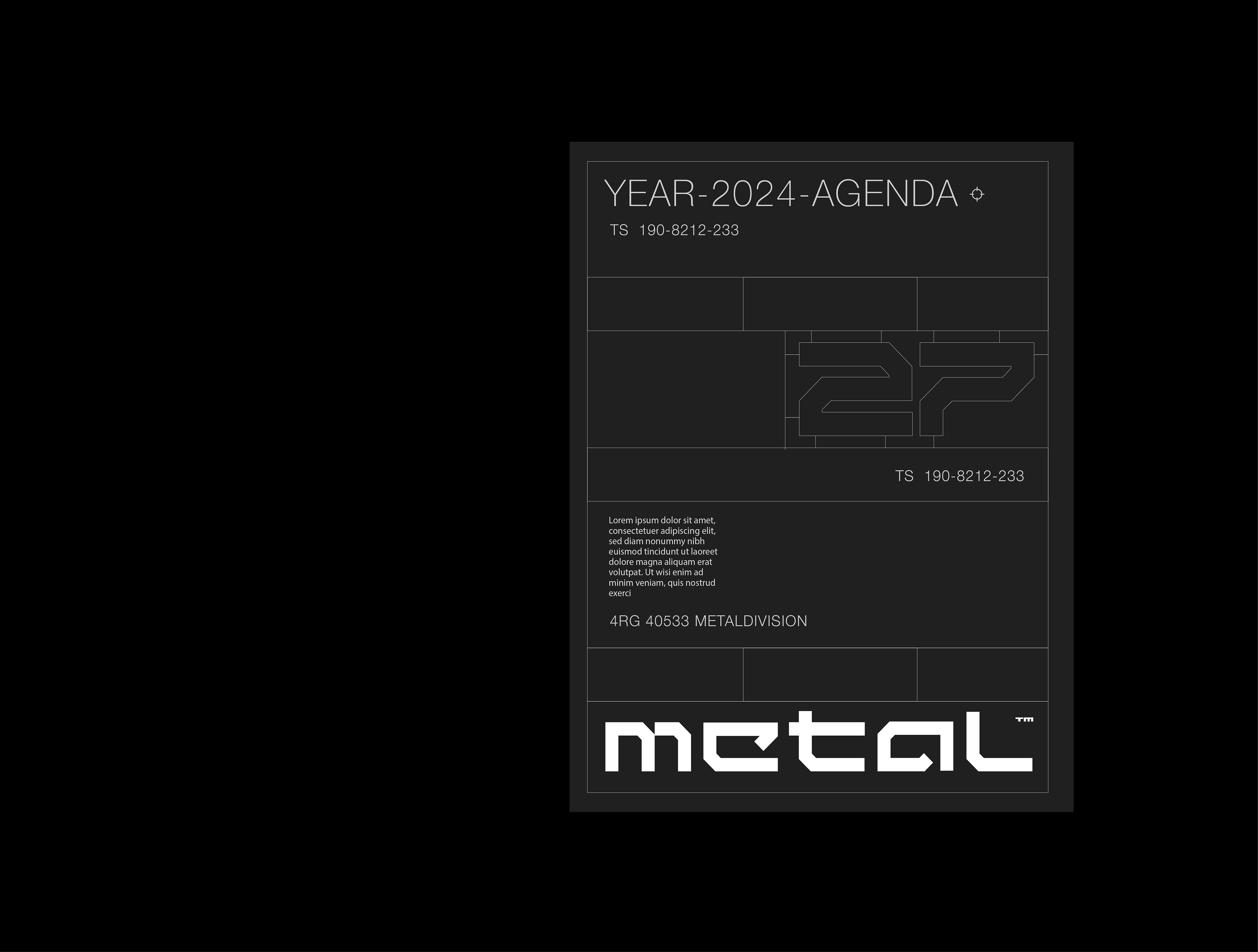
Design Language
Spacing Principles & Brand Elements
We continued exploring with the shapes formed while constructing the logo architecture and realised we could use the same principles to guide the design language used on brand assets.The end result are these frames that always use 4 or 5 rows in their layout. As the Metal word mark has a pretty wide spacing we decided to use it primarily close to one of the edges and based on the logos orientation, the rows are laid out.
These shapes are used in multiple mediums, from print and label to social media design and web applications. The rectangular shape might seem limiting at first but it actually offers a lot of variety through the different spacings and orientations created by the columns.
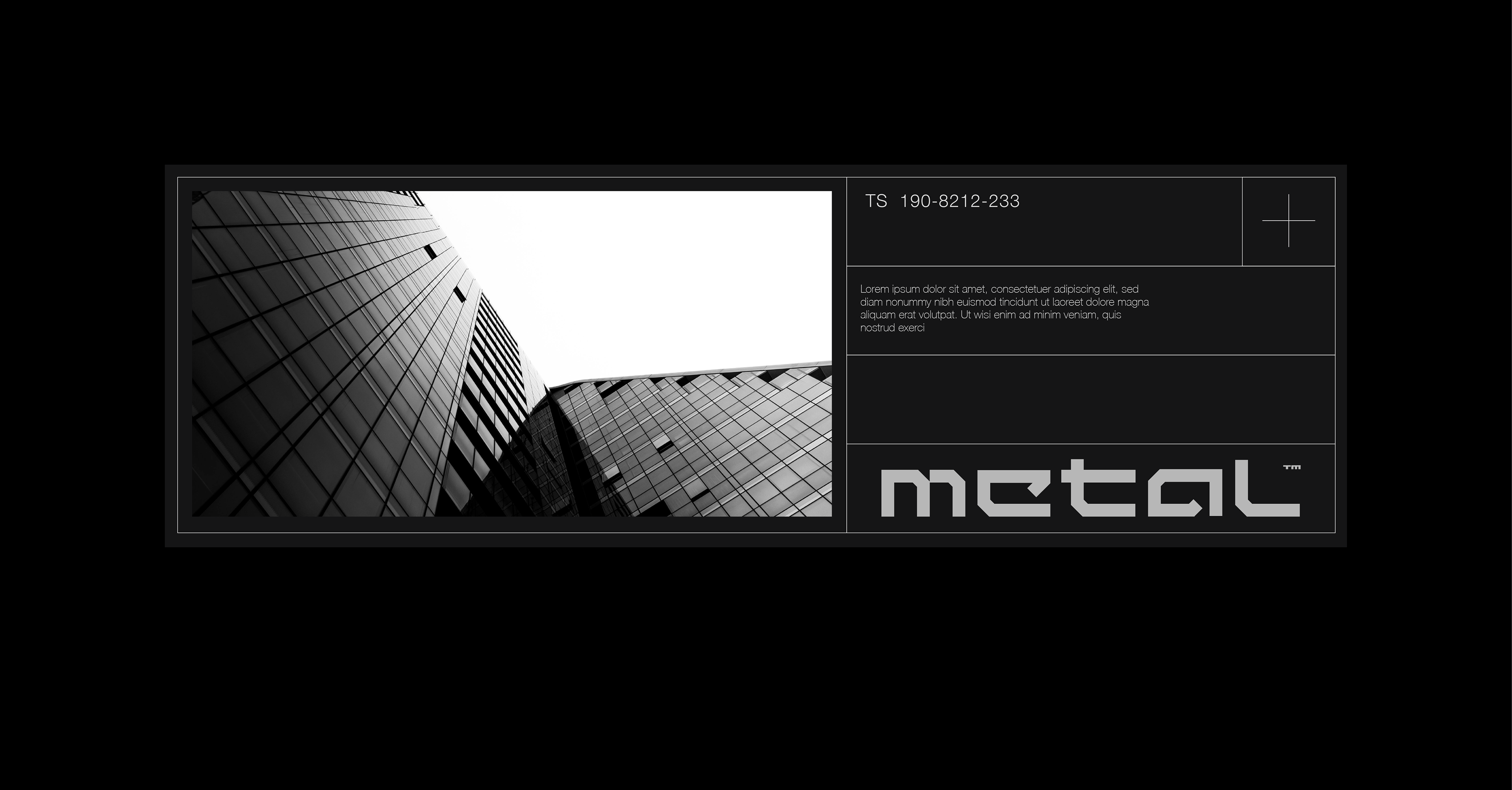
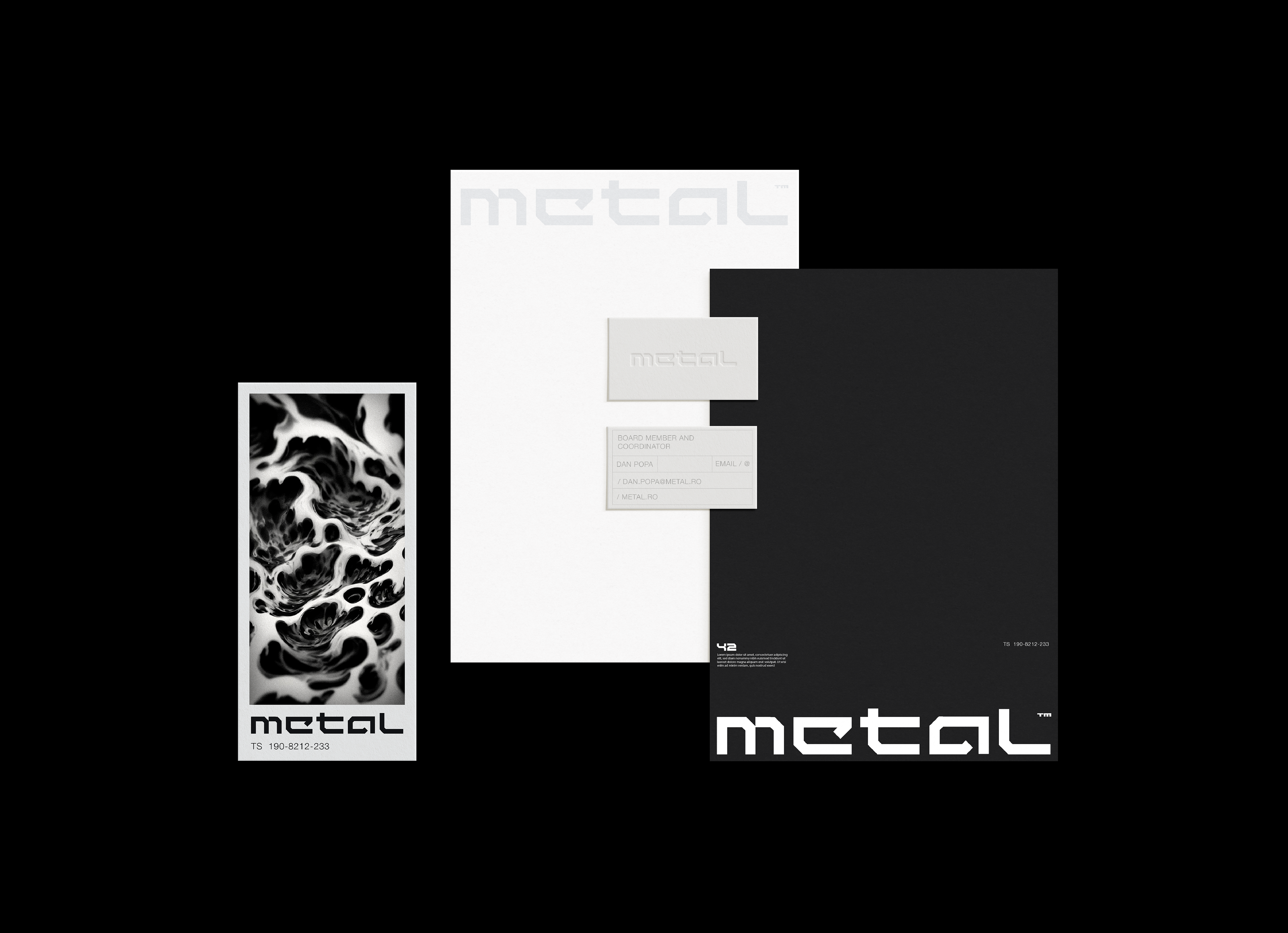
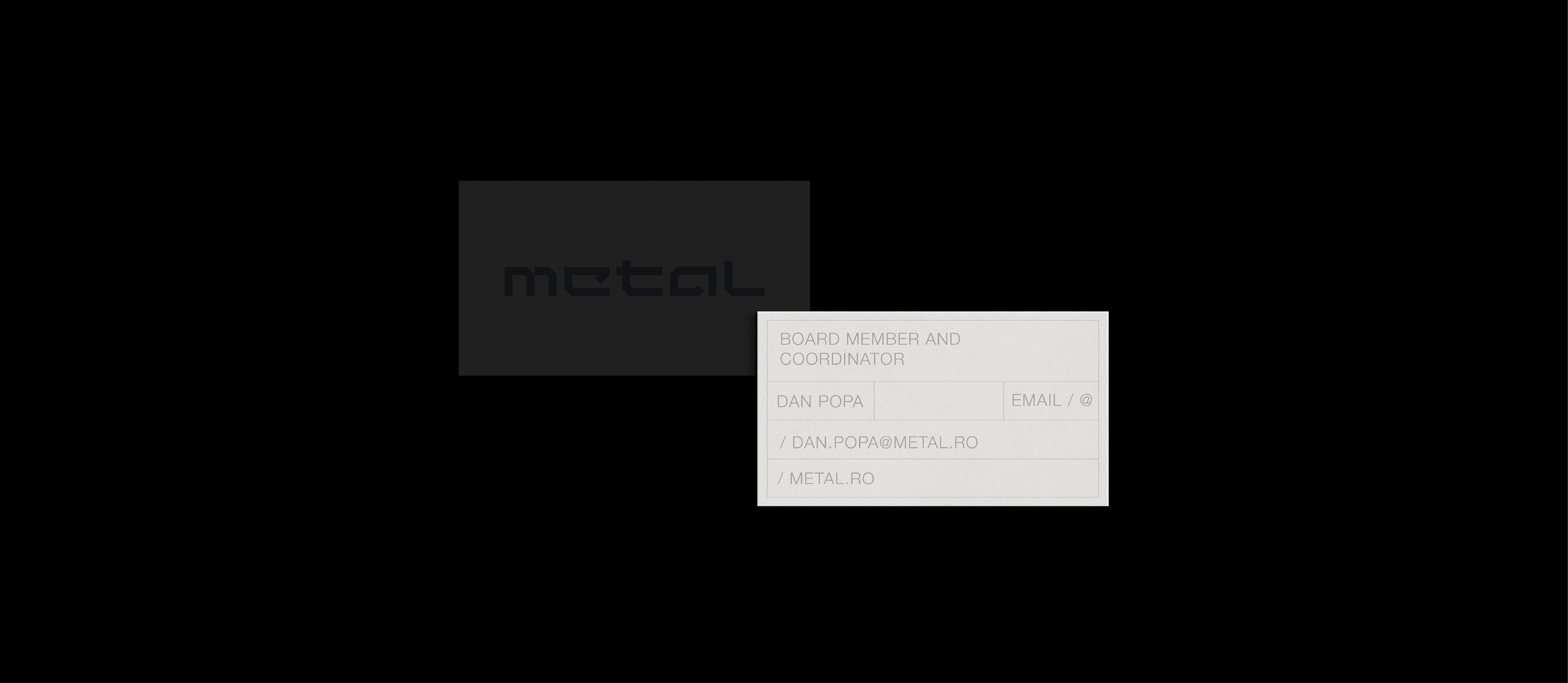
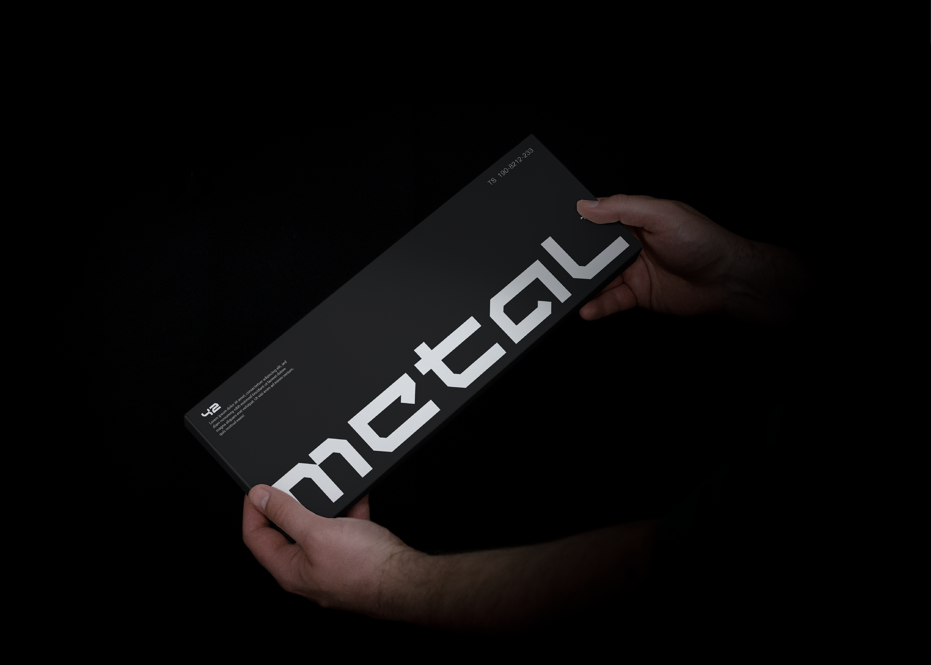
Stationary Design
Print & Color Pallet
After developing the design language we continued with the first physical touchpoint of the brand, the stationary design. It was important to adapted the design principles for print so we used primarily dark tones.
The color pallet is directly inspired by tones found on metal plates. The really dark grey is complimented by light white and grey tones and are accented by a bright royal blue, the predominant color of Metals Division mother company, tying the two companies together.
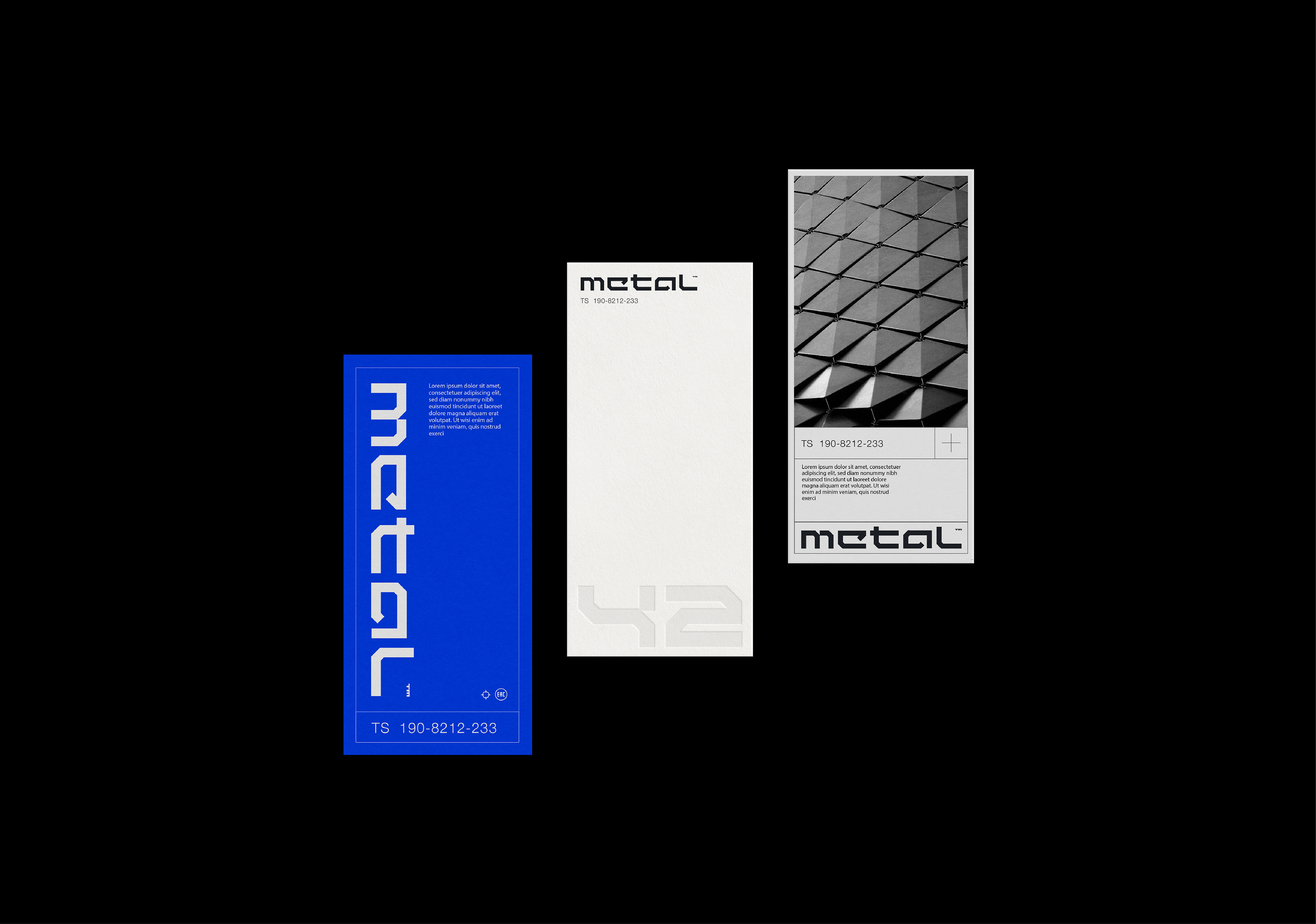
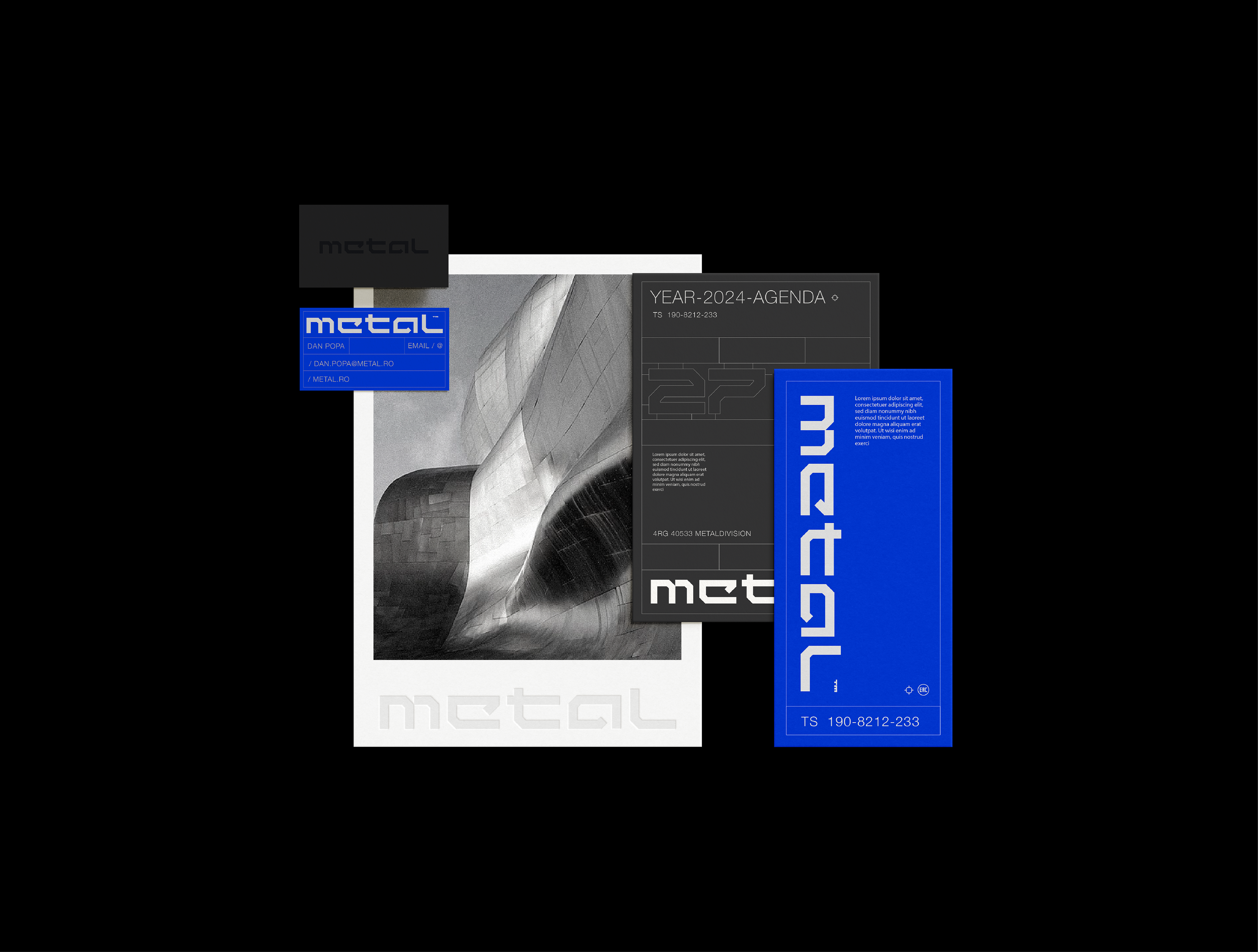
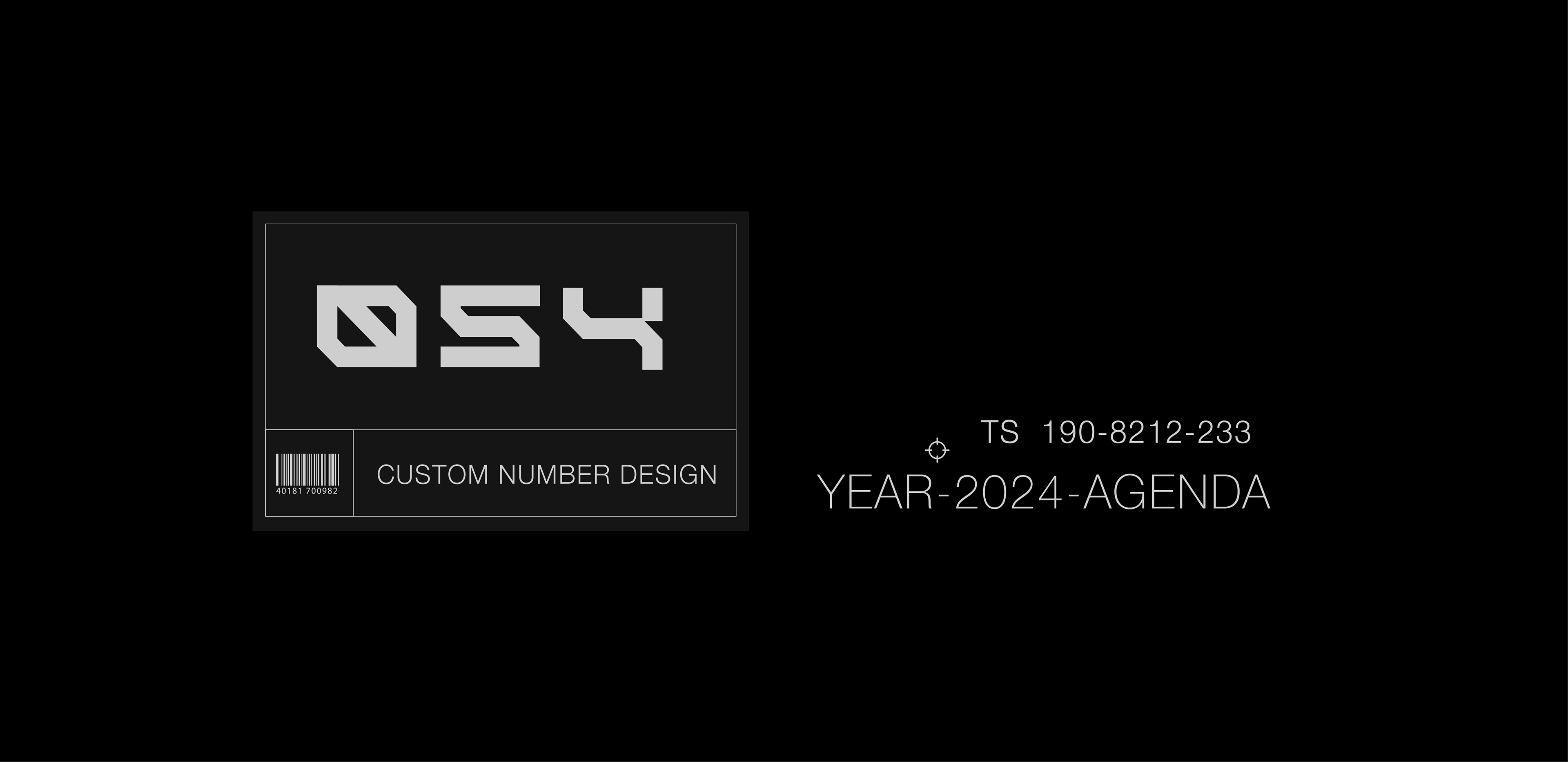
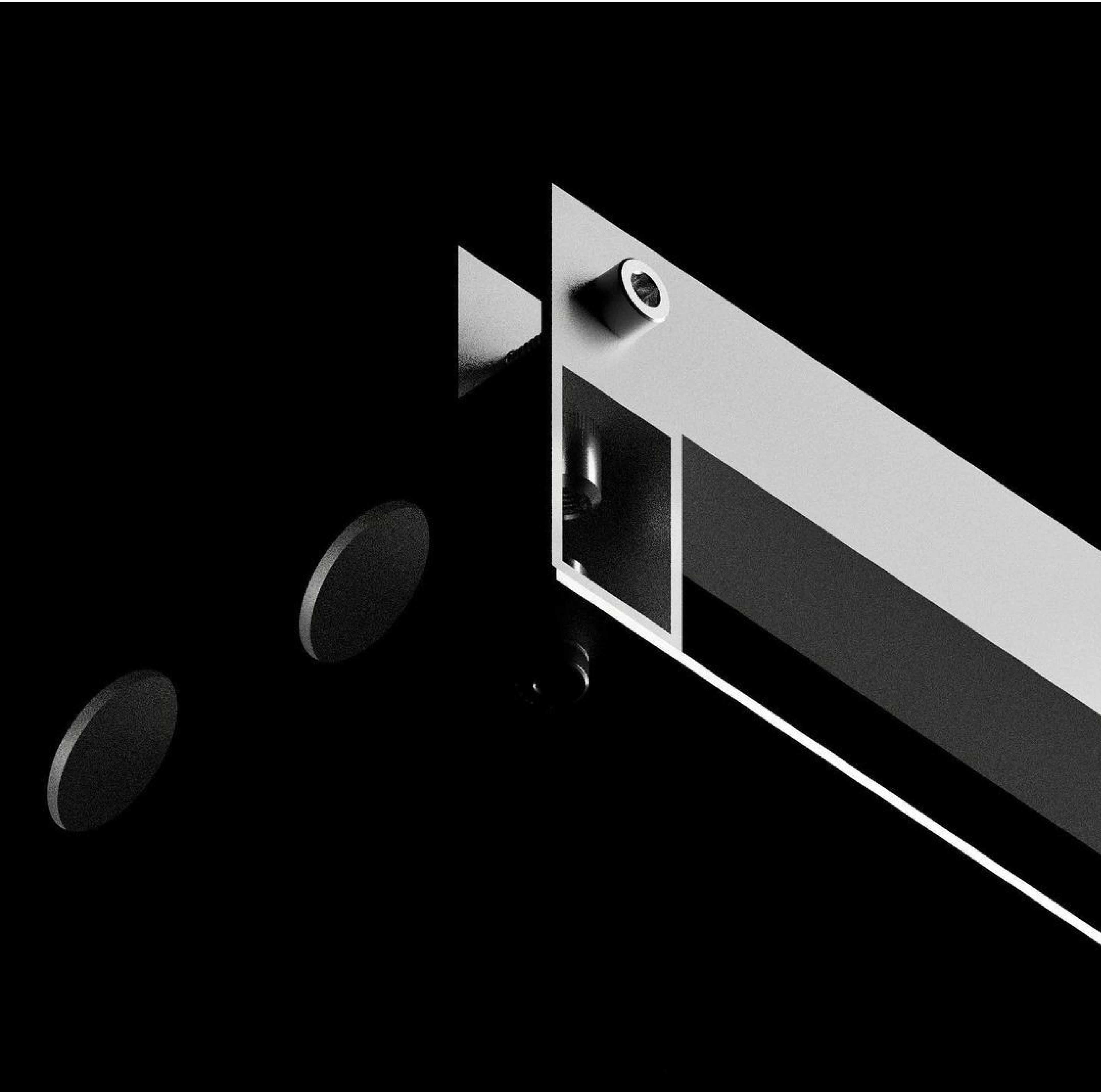
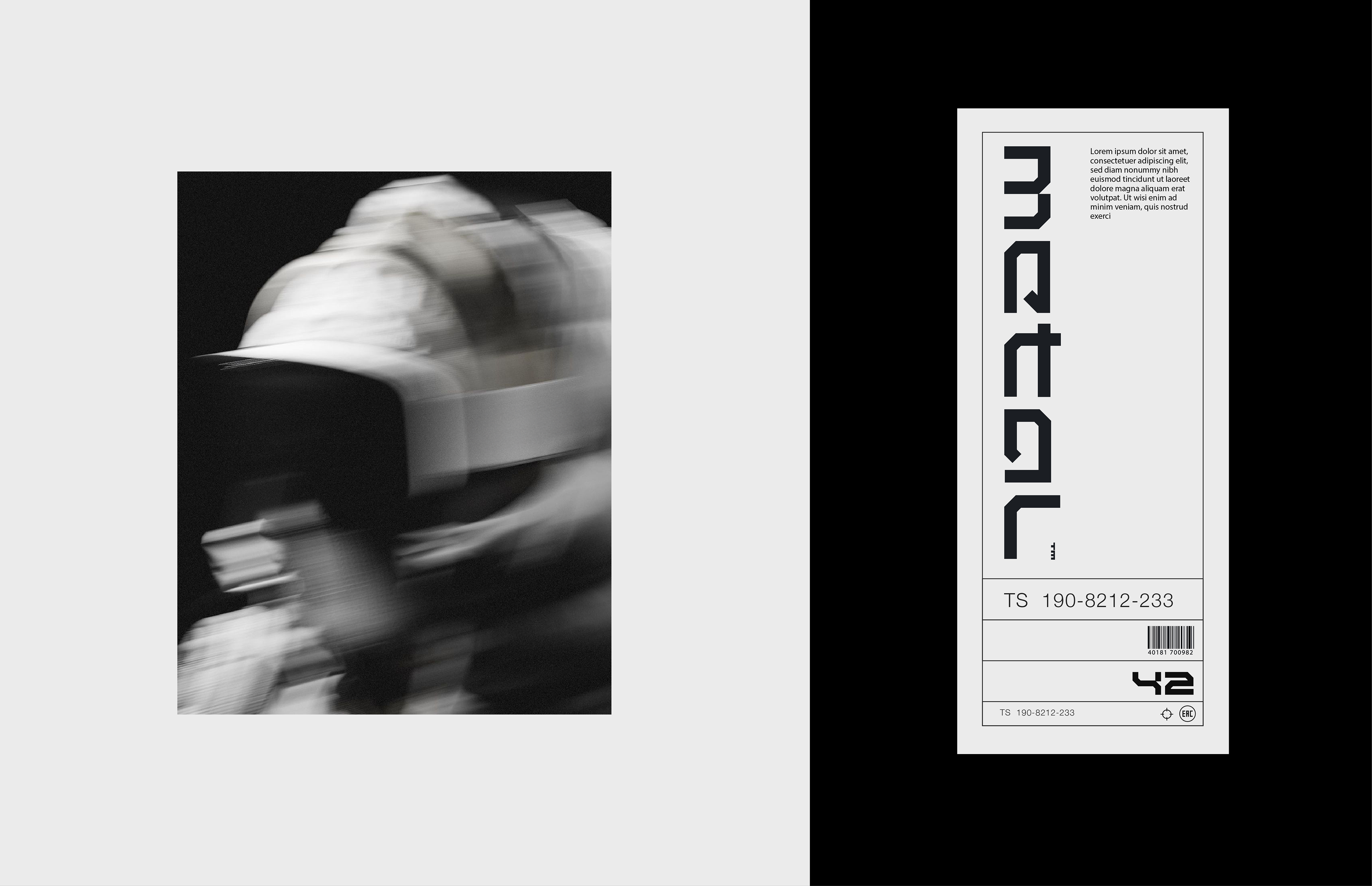
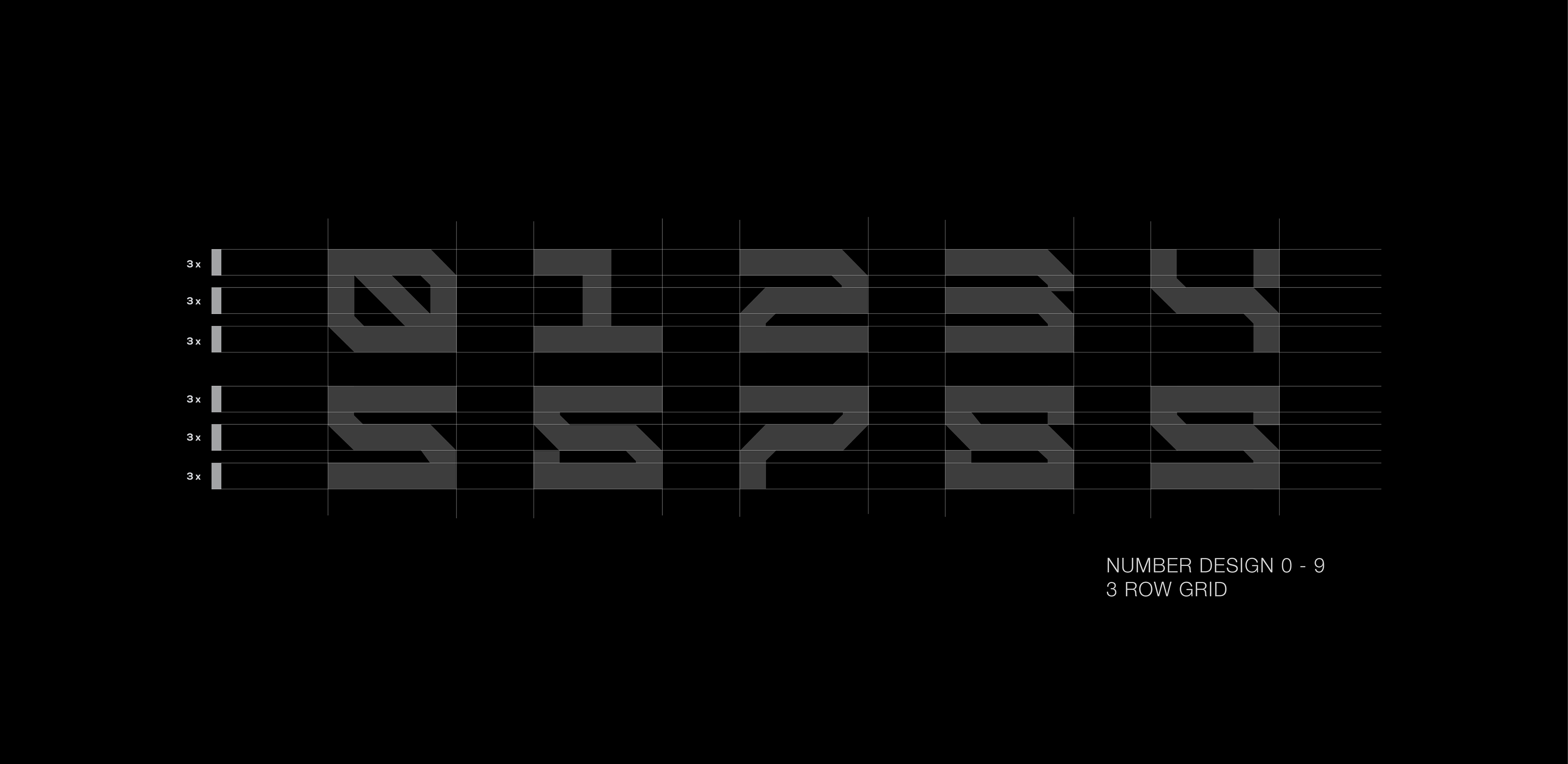
Custom Digit Design
Numeral Concept & Design
Derived from the word mark architecture, we continued with a costum numbering design for the brand to use on metal plates, print and signage throughout the companies facilities. Each number was designed using the same principle used for the word mark logo, 3 rows of lines intersected by vertical and 45° tilted lines. This way we manage to creat numbers that keep the minimal aesthetic of the brand identity and are visible from bigger distances.
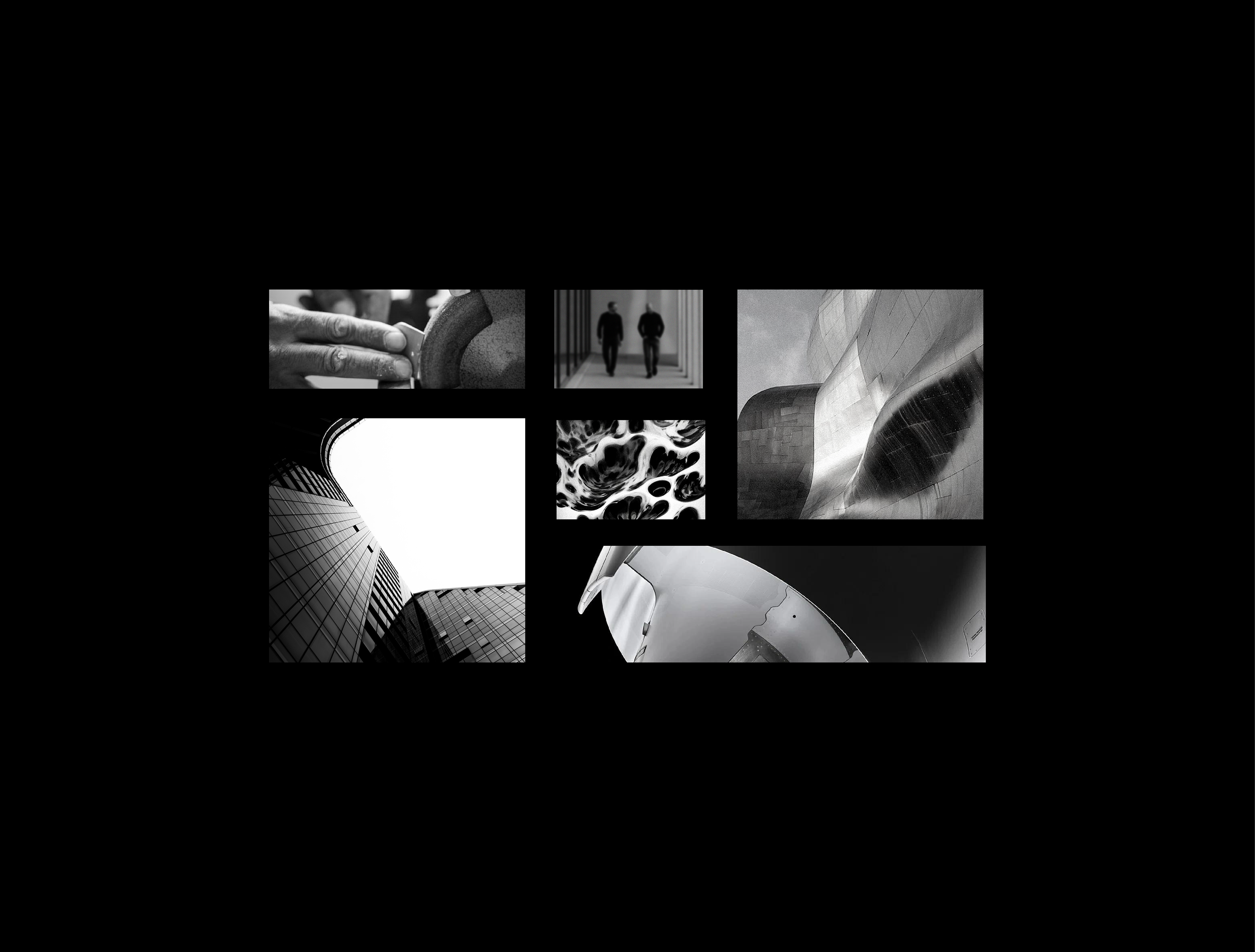
Motion Graphics
Logo & Asset Animation
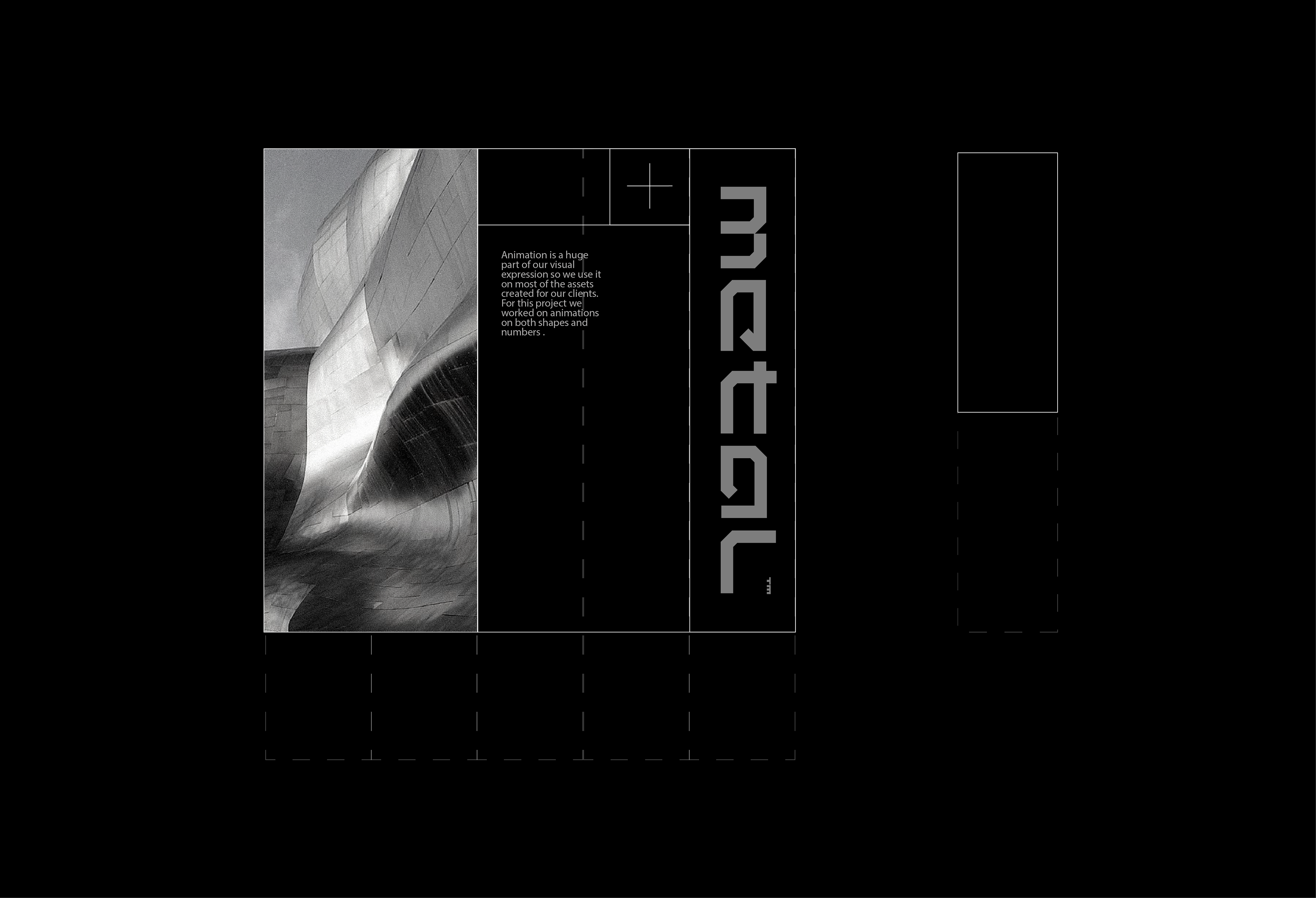
Animation plays a key part in how we present logos, design concepts and assets. For Metal Division we used the natural movements of a CNC in action to animate the lines that form the frames and outlines of letters and numbers. A slow build-up is abruptly cut by the fast moving spark that form the letter. This approach was then transferred to all motion graphic presentation and assets, to give the brand another layer of cohesion.