Arctech Logo Design
The Brief
Arctech, is an innovative IT start-up based in Arad set to make an impact through their young core. We were glad to help them out with a minimal logo design.
The task at hand: A minimal logo design and brand identity comprised of a symbol and typeface, that would stand out and be memorable but would also distinguish the company from their industry competitors. The IT consultancy landscape in Romania has fallen behind when it comes to visual identities. Arctech wanted something new and as said in their words: something fresh and new, something that doesn't look like your average IT consolation and backend company.
The Logo Design
The arc was at the center of our design concept, and as we went for an arctic and cold aesthetic, we got inspired by the snowflake patterns found in nature. The company is formed by 3 friends, each represented in the final logo structure by an arch which together forming a triangular shape in the middle of the symbol.
The Art Direction
With a great name like Arctech we wanted to creat a concept that would include elements derived from the name but not just deign a "arc". The need for something "fresh" sparked the idea to go towards a concept that combined arctic elements a cooler tones of color, as seen in the mood-board above.
The Color Pallet
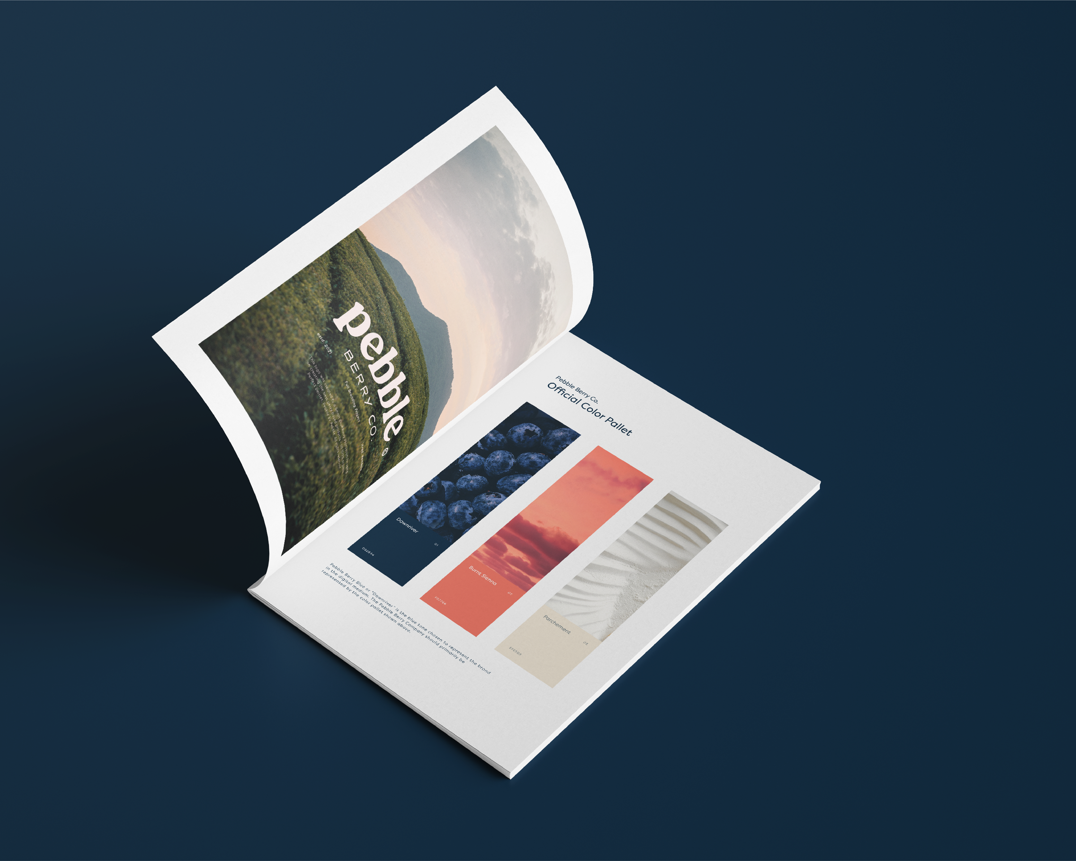
To complement the overall aesthetic and art direction we went for a one tone color pallet that uses a purple-blue color called Electric Violet as the main color, which gives the brand identity the needed charge of color to stand out but also fit the tech world. Complementing the main color are the dark charcoal nuance called Woodsmoke and a turquoise-grey tone called Botticelli.
Thank you for watching!
Follow us at @studio.maller
Client: Arctech © 2023
