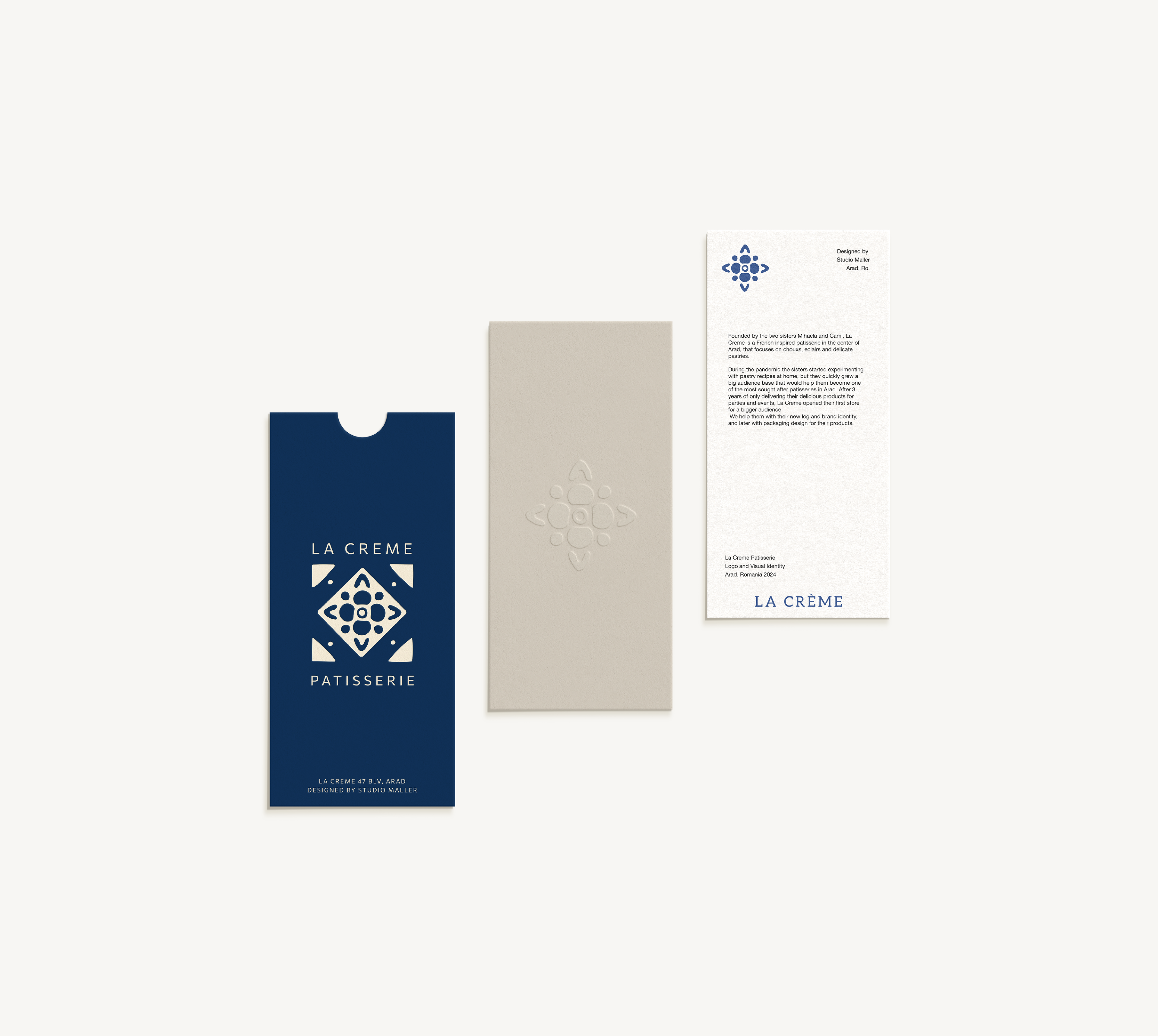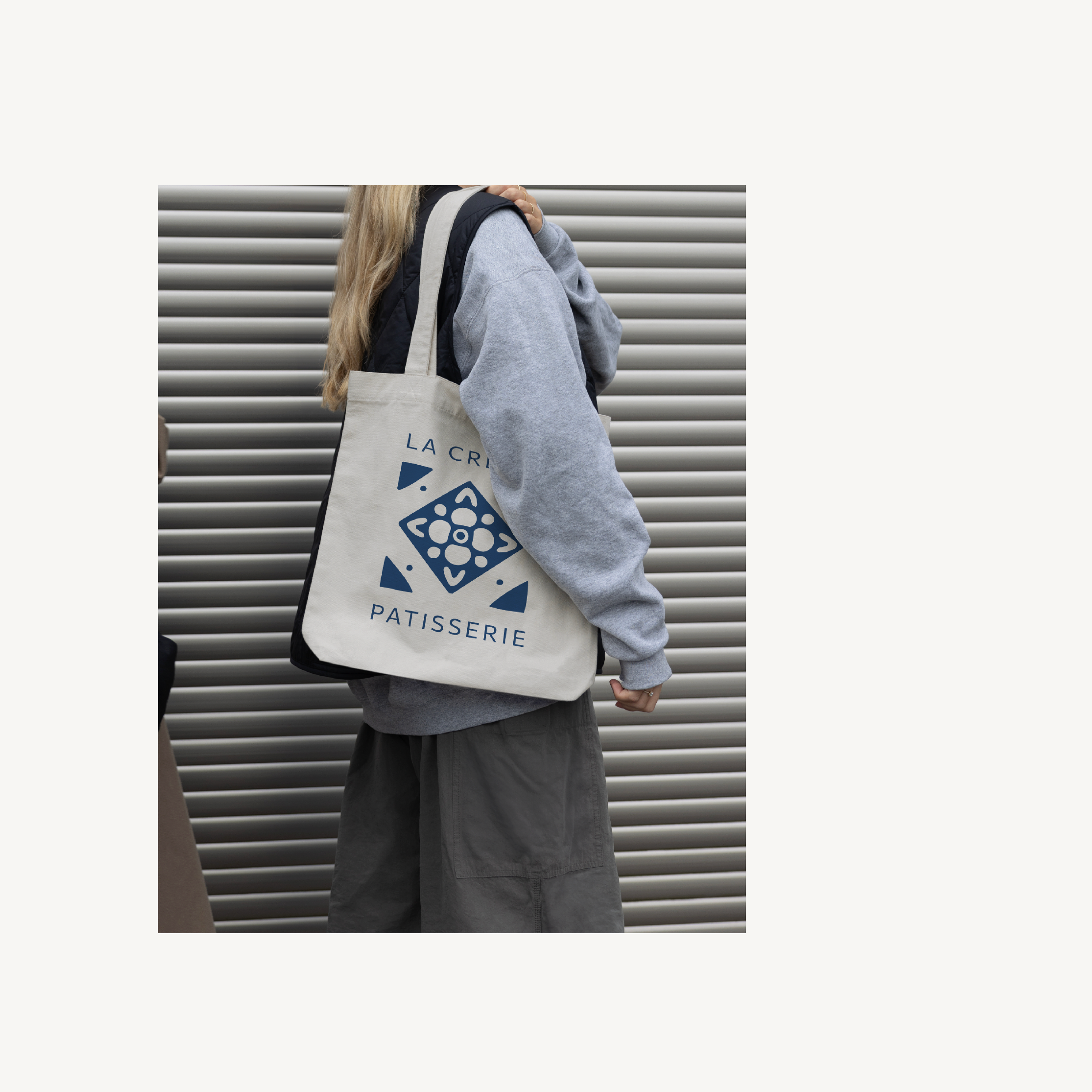
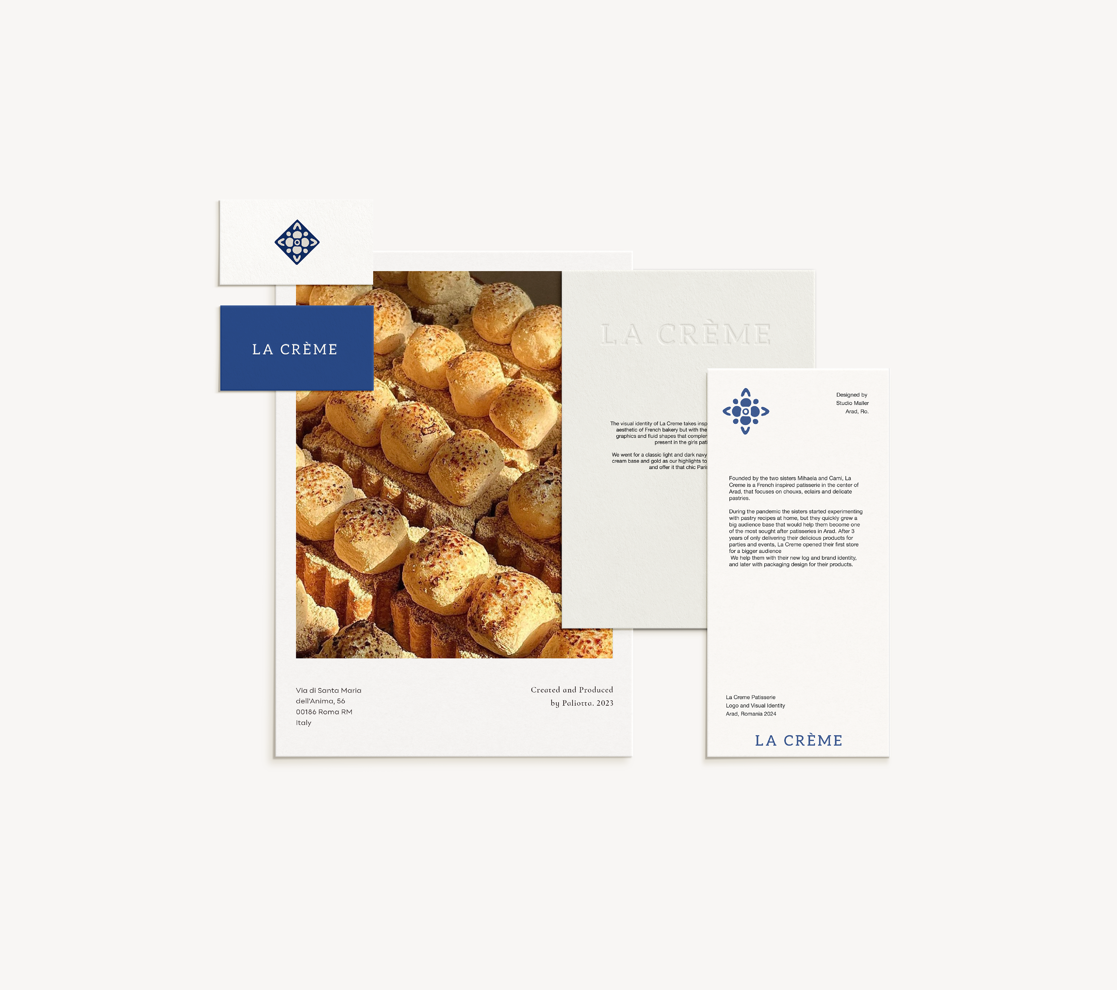
La Crème Pâtisserie
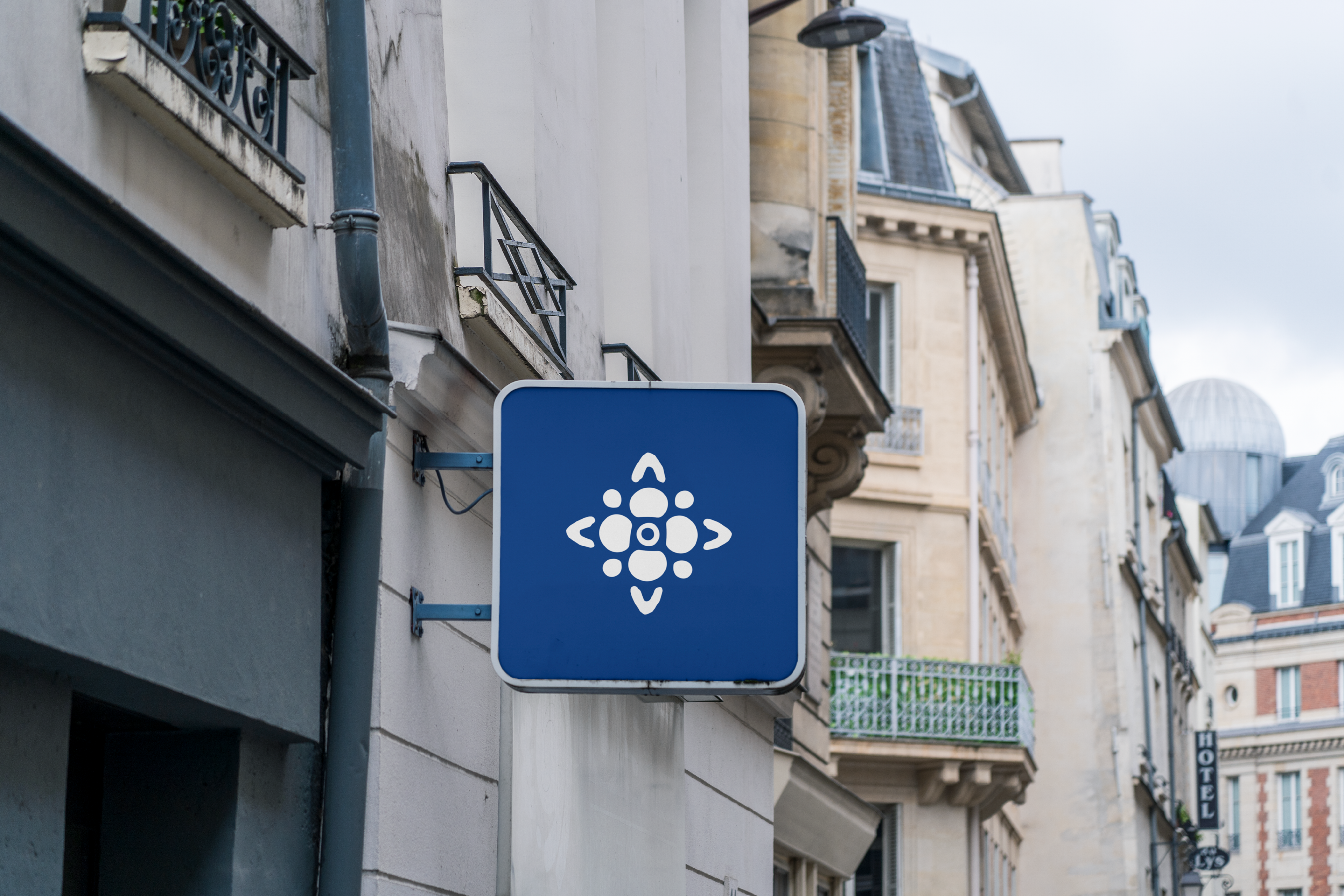
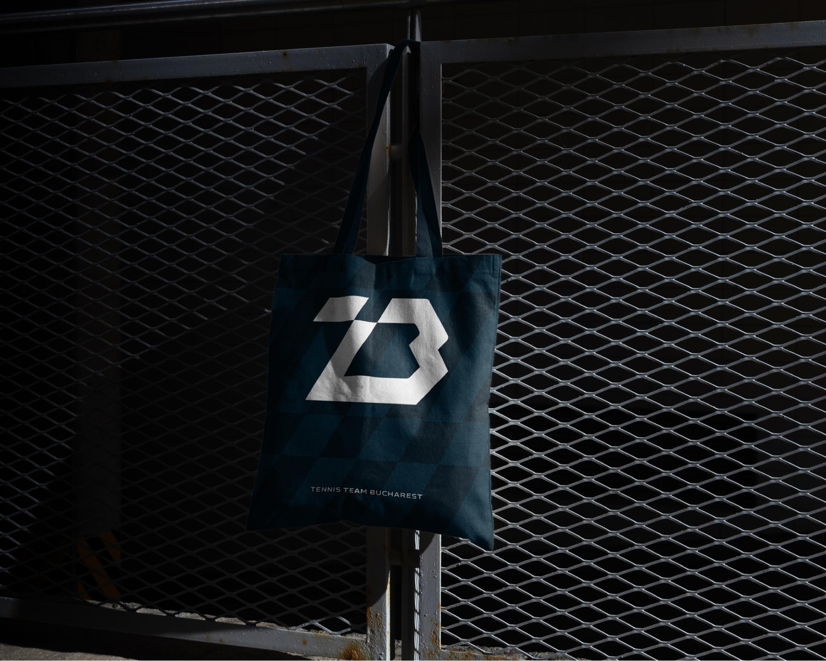
Logo and Visual Identity
Arad, Romania 2024
Founded by the two sisters Mihaela and Cami, La Creme is a French inspired patisserie in the center of Arad, that focuses on chouxs, eclairs and delicate pastries.
During the pandemic the sisters started experimenting with pastry recipes at home, but they quickly grew a big audience base that would help them become one of the most sought after patisseries in Arad. After 3 years of only delivering their delicious products for parties and events, La Creme opened their first store to offer a bigger audience the full Parisian patisserie experience.
Our Services for La Creme: Logo Design, Brand Identity, Packaging Design
Studio Maller © 2024

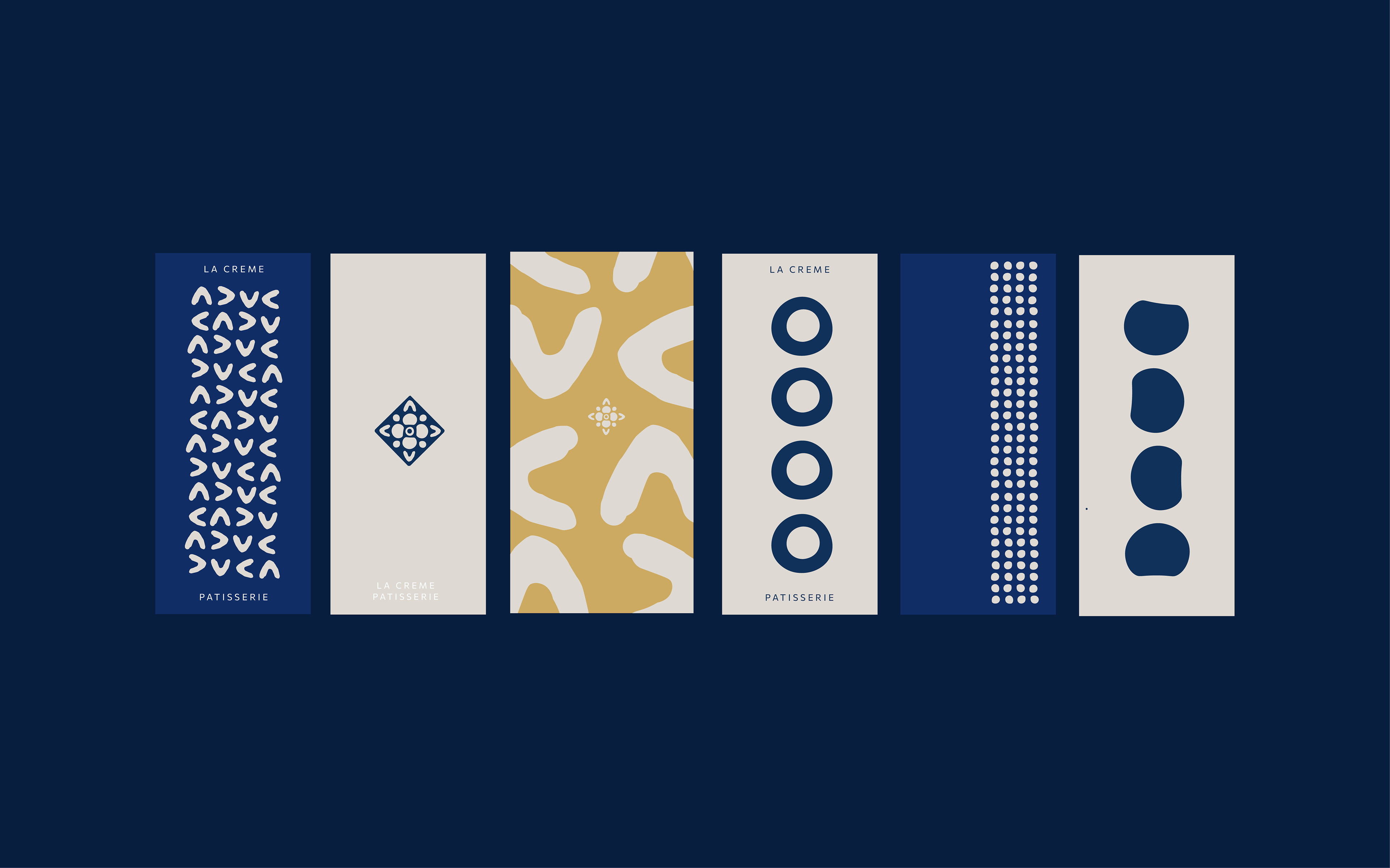
Logo Concept Breakdown
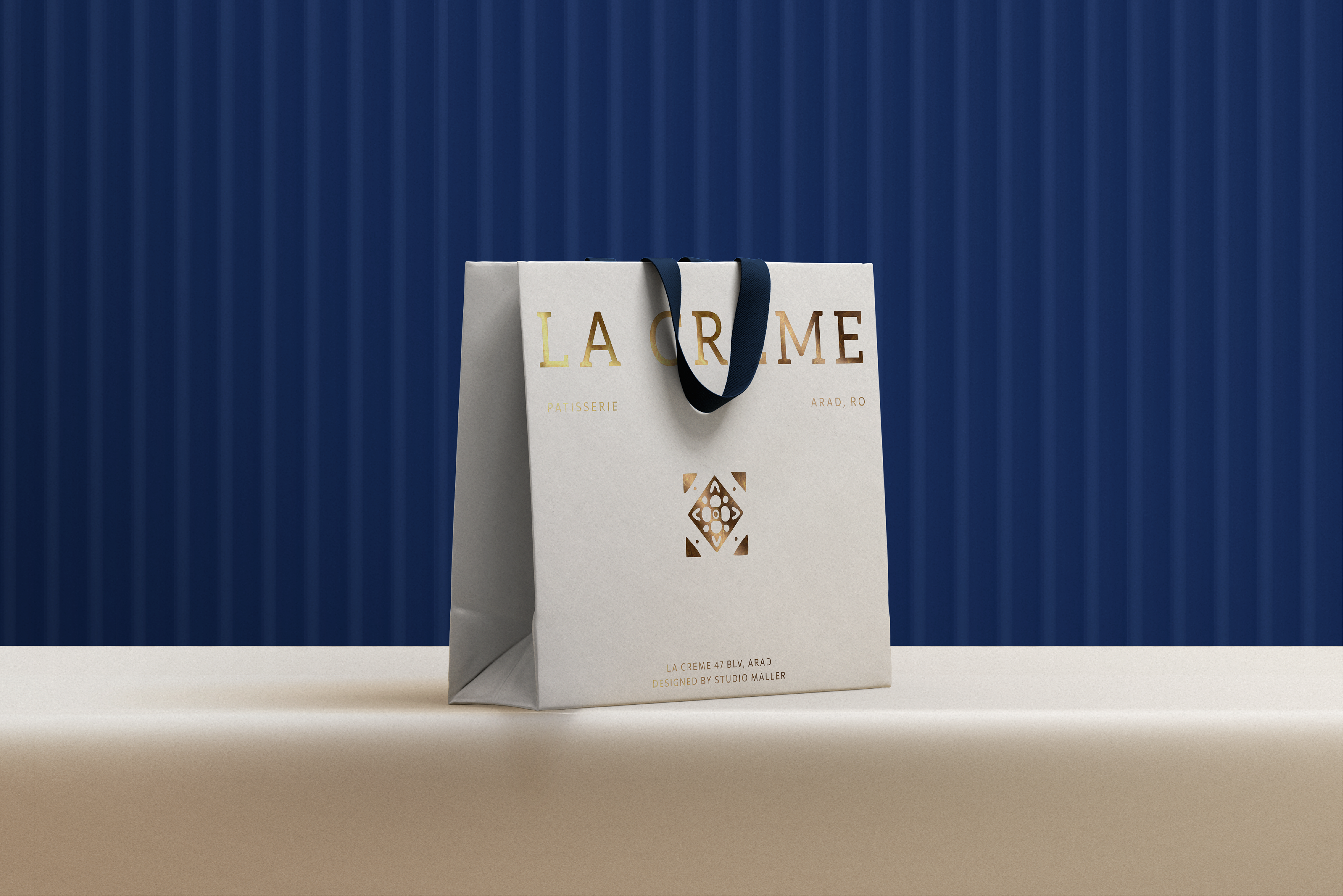
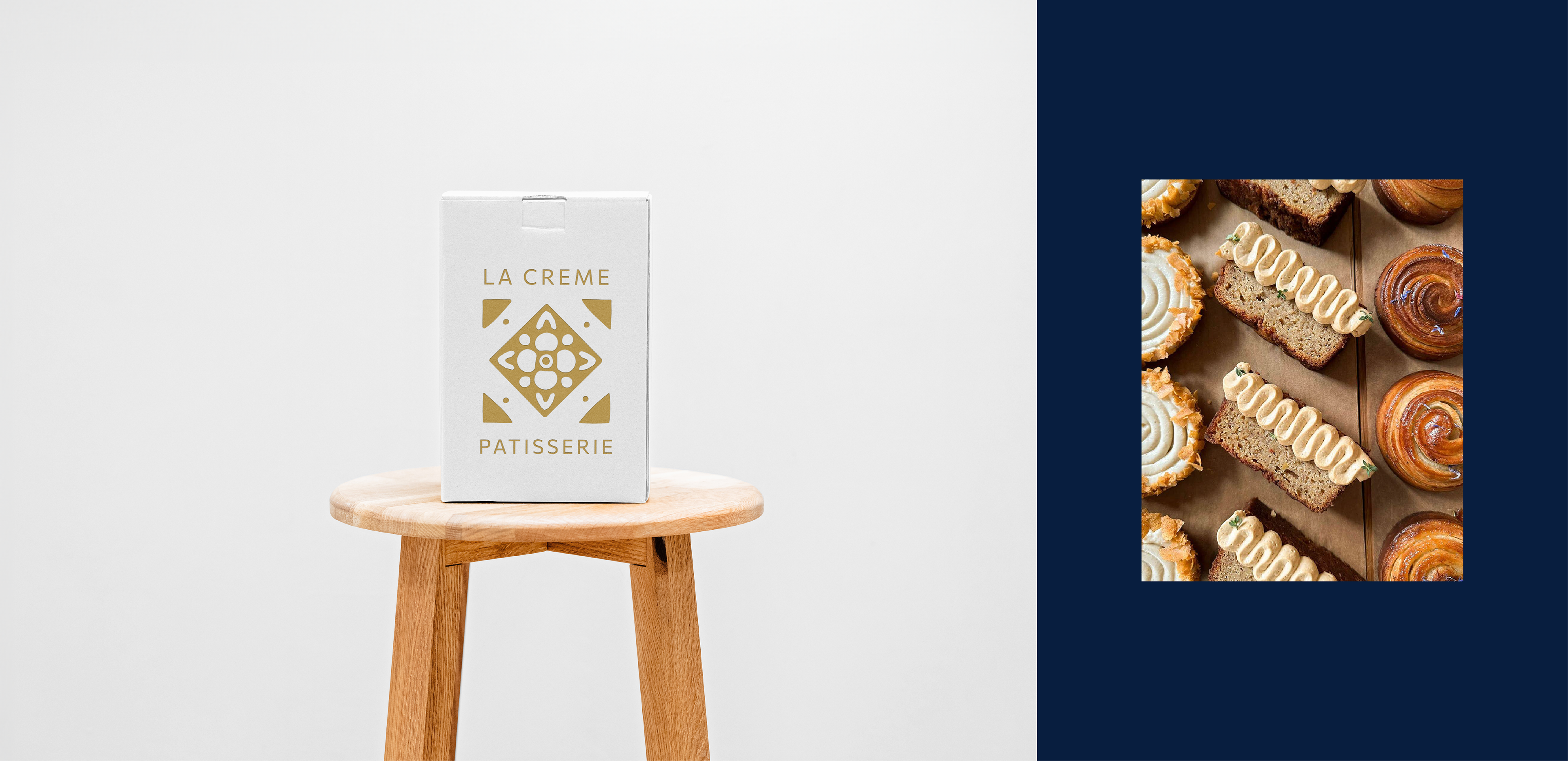
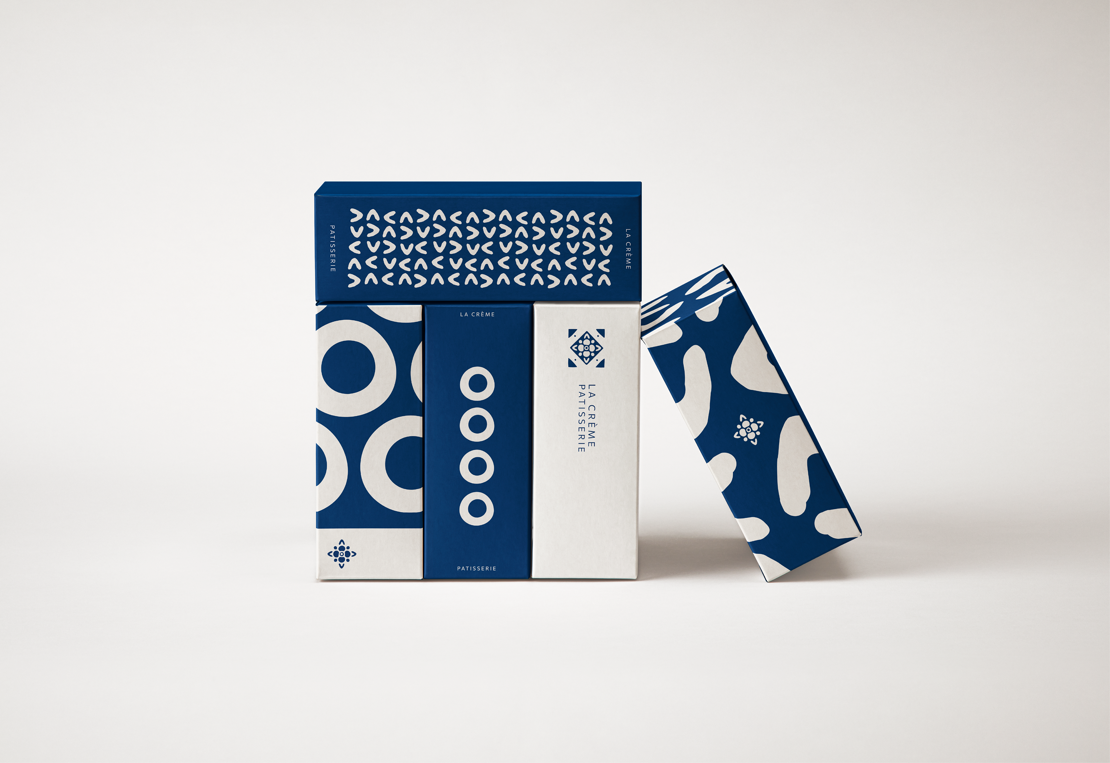
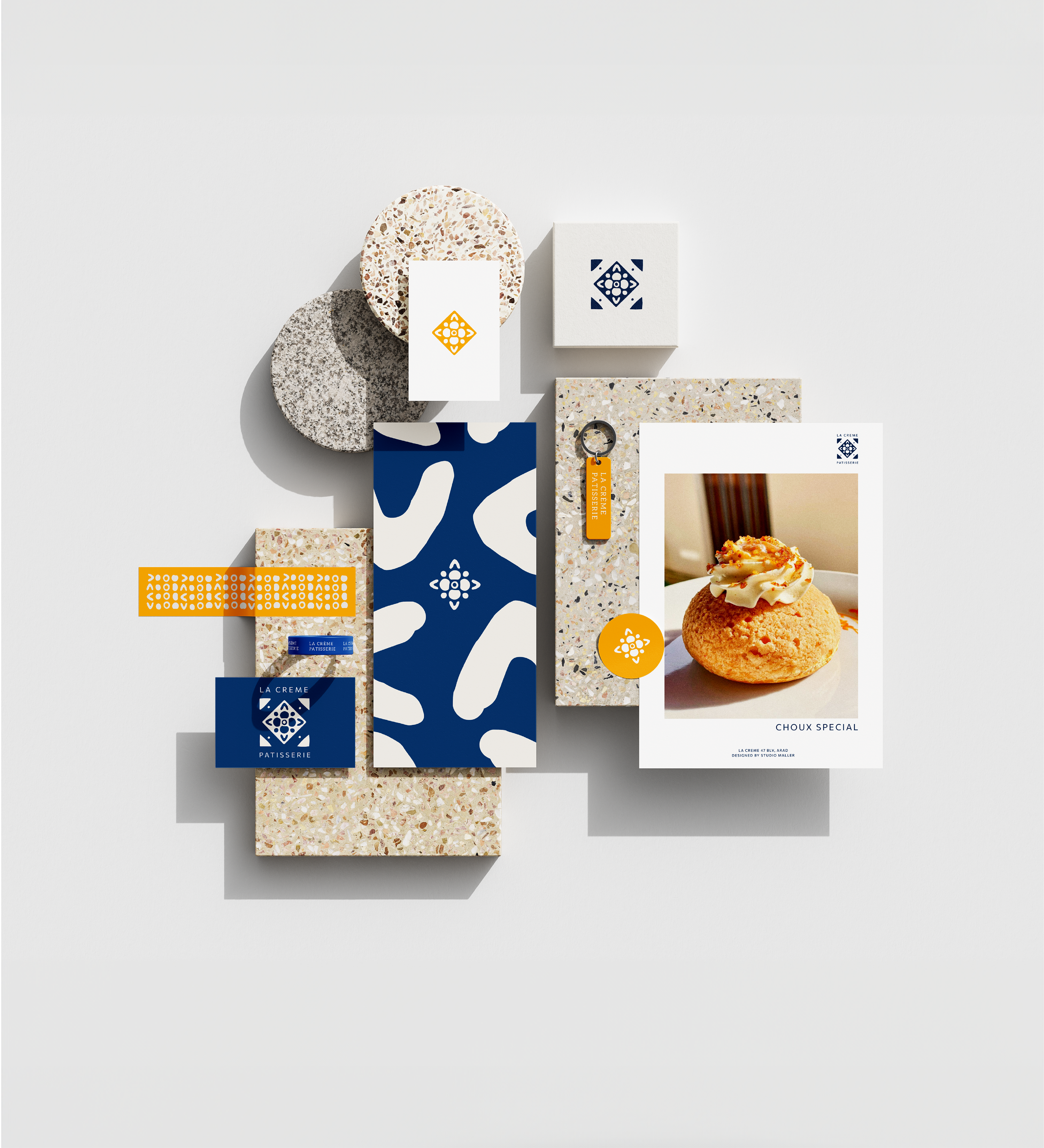
Illustrations & Packaging Design
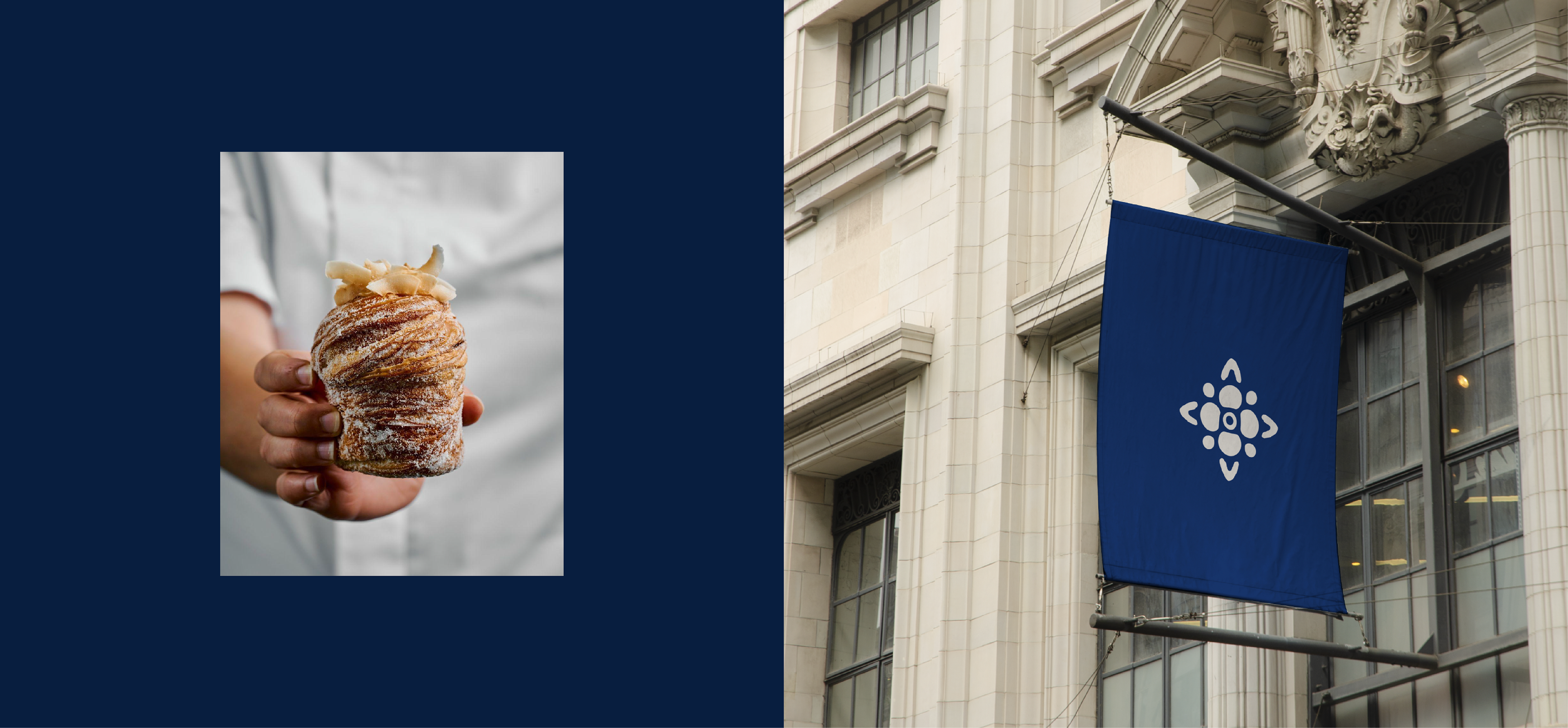
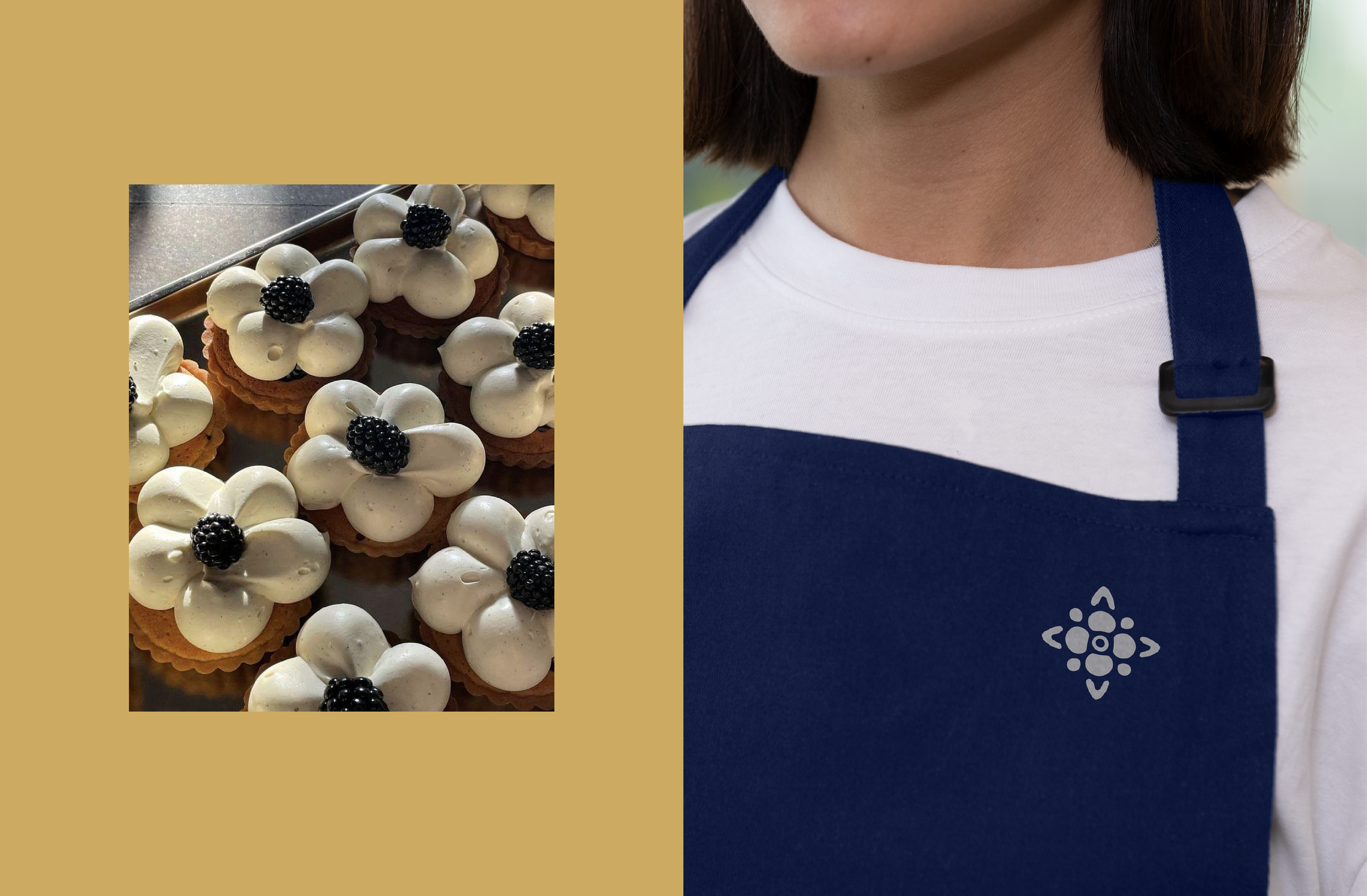
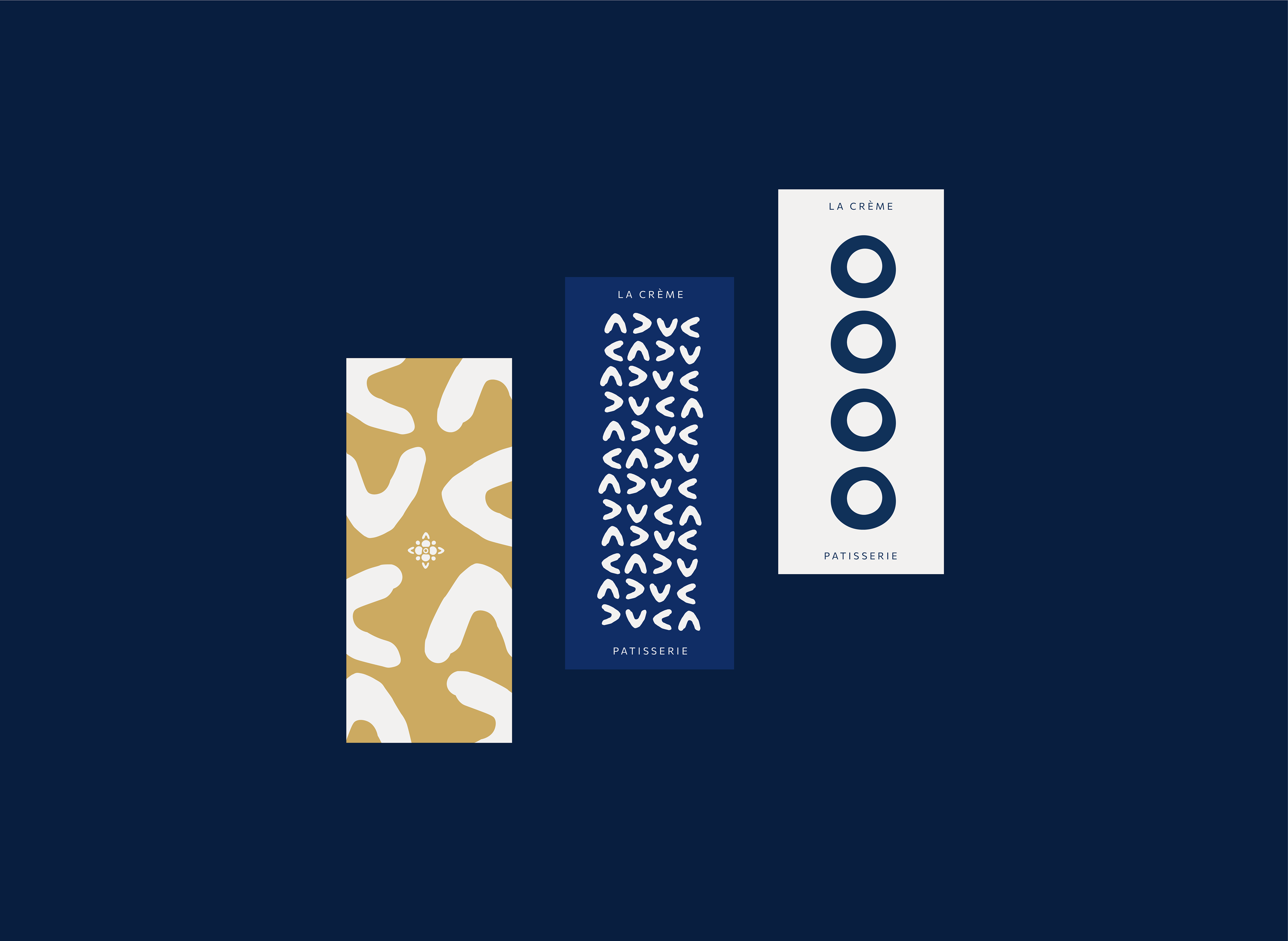
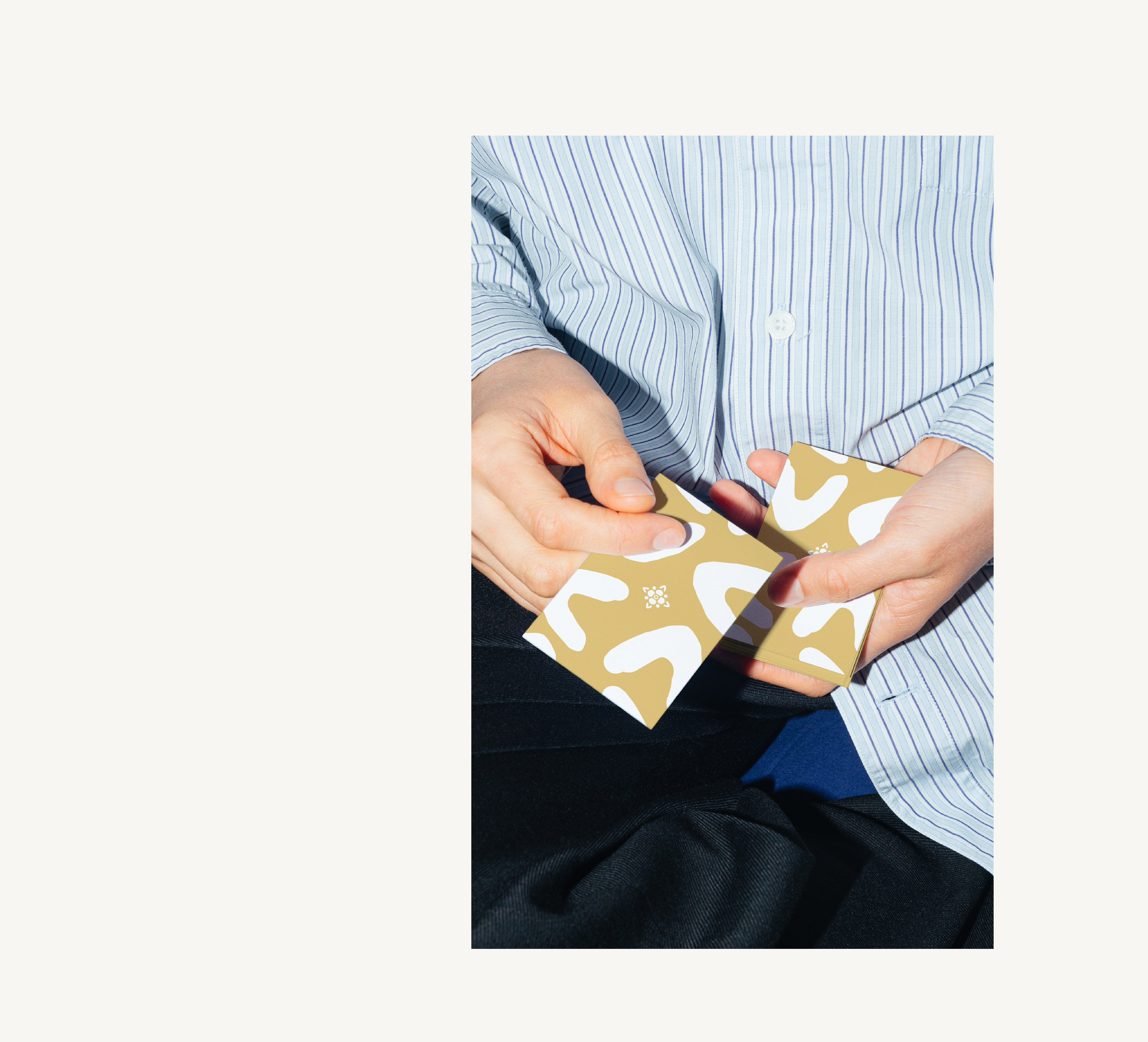
The visual identity of La Creme takes inspiration from the traditional aesthetic of French bakery but with the added twist of minimal graphics and fluid shapes that complement the artistry already present in the girls patisserie. We went for a classic light and dark navy blue as our accent color, cream base and gold as our highlights to further elevate the brand and offer it that chic Parisian look.
The complex shaped La Creme logo symbol is complement by a more simple yet elegant font in Aleo Regular, a serif font that adds the feeling of heritage and Parisian proudness.
La Creme's well crafted pastries are all created using delicately designed shapes to form beautiful composition. So it was clear that we had to integrate these into the final identity. Not only do the shapes form the log symbol, they also act as patterns for packaging, background and design assets.
Brand Elements
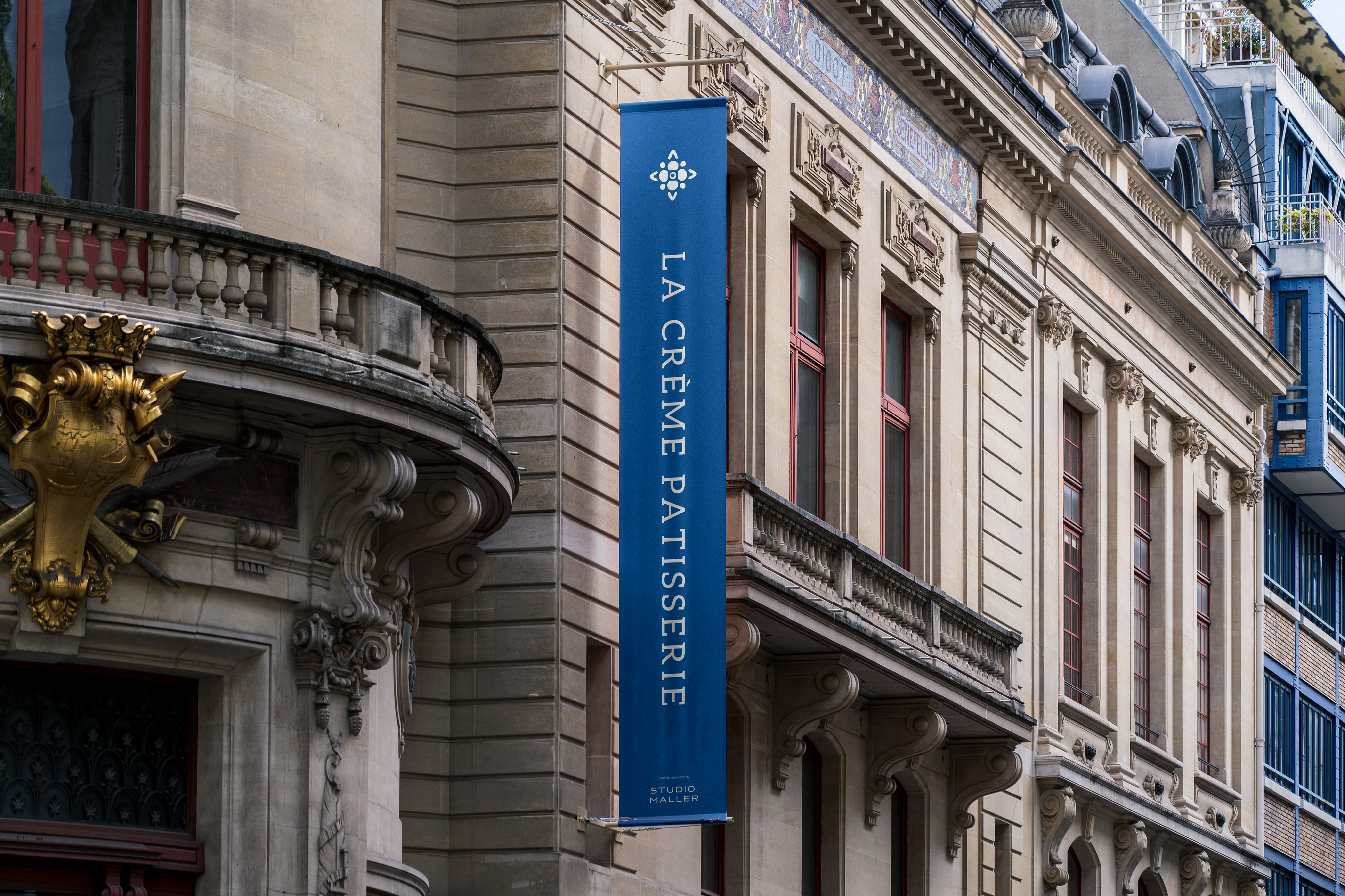
Print Design & Visual Identity
A further challenge was to create a brand identity that can both be simple, minimal and organic, but is also able transform into a chic and glamours brand that can evoke the Parisian spirit and reflect de delicate nature of La Cremes product. The dark blue tones is a strong and instantly recognisable base, but the gold accents combined with the carefully designed layouts position the patisserie as a premium brand.